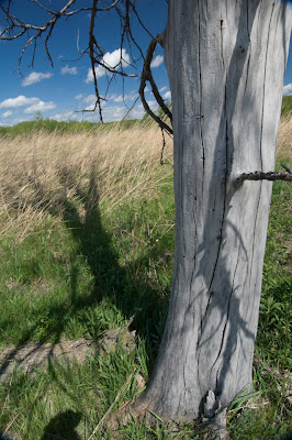
A fairly unassuming image was chosen for this series to show that by thinking in terms of design elements and principles any image can be enhanced. In part three several questions were asked and problems pointed out about the image.
It lacked style, was not very creative, and much of the story is about texture... but what texture did I want to emphasize? The tree of course, but why? In relation to what? Is texture it, the whole story, or is there something else?
Using the elements of design I can begin the process of abstraction which I define as focusing on pieces of the whole (design elements) and enhancing them for emphasis of the image's purpose. If the tree is a study in texture then increasing contrast is one method of creating more visual texture as seen below. A closer crop was also use to bring out more detail. I find that cropping will continually change as you hone in on the image's purpose.
At this point there is increased texture in the grass and tree, but they are equally strong and competing for attention. The grass could be deemphasized by blurring or defocussing it in Photoshop, but my personal preference is to build a complementary relationship and not just an opposing one like focused and not focused elements.
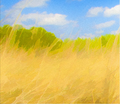
In the next blog post I will cover in detail the use of the Topaz Labs set of image editing tools as they relate to the elements of design. In the above image I used Topaz Simplify to abstract the background. It is now softer, more colorful, and less focused. The impressionistic treatment complements and brings out the texture of the tree which now stands higher in the visual hierarchy, and this is what you want if the subject is a tree in a field and not a field with a tree.
The tree is fairly smooth however. Using Topaz Clarity and Adjust I can increase the texture to the desired level as seen below.
In Photoshop each change to the image is placed on separate layers. In this case I was able to increase the texture of the tree, but did not touch the rest of the image. Everything on the enhanced tree texture layer is masked out except for the tree itself, thereby leaving the grass untouched. These are small images and a lot of detail in the actual file cannot be seen.
The images to the left show close ups. The top does not have grain, and the bottom has some grain added through the Topaz tools. The level of grain can be controlled to mimic film grain or increased in visibility to the level of creating its own abstracting effect. In this case I wanted the grass to be a little less smooth and to have slightly increased visual interest when the image is viewed close up.
 Topaz Simplify is an very controllable regarding the amount of simplification applied to an image. In the case of the image above the tree may be standing out too much as though it were plopped down into an impressionistic painting. But the goal of bringing the tree forward as a focal point was accomplished.
At this point it is a fine tuning process. As I worked the image I wondered if this was still a textural study?. Texture is what initially drew me into the image, but what about the initial point of creation when shooting the tree? It wasn't about texture really. I felt there was a story to be told. The image has been improved, but is that enough? Did I miss the point, miss the story, and the initial purpose of the image?
The tree was integral to the initial shot. It stood strong, but was dead. It was alone in an open field. It was colorless and shadowed within a colorful sun filled context. It was gnarled, hard, and rough in a soft landscape. But it was the fact that it was dead with life all around it that struck me, standing like a gray tombstone demarcating a line between death and the life all around it.
Paintings do not have a sound dimension for the most part. The subtle sounds of wind blowing through the grass and crickets and cicada singing were auditory memories only. I added a just hatched cicada to the image above in keeping with what was becoming the theme of the work. As I reentered the original experience of being in that field the addition of the cicada brought me back to story telling. As this theme developed I noticed that the field needed further deemphasis which lead to the last cropping of the image shown below. The tree and the cicada are now equal and integral to the story, and the focus needs to be on them.
 I suppose the story is just the old circle of life story. Birth and death playing out their parts continually. The tree is still prominent, but in working the image I felt that texture wasn't enough. Something else was needed to create a conceptual higher order of interest. The cicada is a Taiwanese variety, and is located on a rule of thirds node. It is also visually bordered and held central by the trunk on the right the shadow on the left and the dark branches at the top.
The image came a long from the the original shot shown to the left. I suppose the image's purpose began with story telling, then the journey lead to an interest in texture to create a visual impact, then I came back to story telling again.
The texture in the tree is striking, and there is enough but not too much visual interest left in the grass. I'm not sure in the end however that the image stands on its own. I believe that it may make a good illustration in a book, but for me it wouldn't be one that I'd print as a work of art.
This post focused on the design element of texture and to a lesser extent color. Cropping and abstraction were used to bring the subject to the fore, creating a proper relationship between foreground and background. Abstracting the background help to separate foreground and background and put the subject its proper place in the visual hierarchy. Contrast was discussed in both texture and color (or lack there of in the tree). Directional movement or visual flow exist in the relationship between the cicada and how it is framed by the elements surrounding it.
In the next post all of the elements of design will be discussed and how they can be manipulated by the Topaz set of tools and Photoshop.


No comments:
Post a Comment