Wednesday, September 11, 2013

The Elements of Design via Digital Tools (Part 3 - Shape)


This will be a longer post than usual. Towards the middle of the post I got carried away with some theoretical ideas that I intuitively feel are true, but scientists are only starting to formally study. It is worth reading through to the end because the design element shape is such a cornerstone of design second maybe only to color, and digital tools do such a good job of controlling and abstracting shapes as you'll see.

Shape - The image to the left is from online learning materials from the Natomus High School's design department. I think of shape as the most primitive design element, and by primitive I mean basic, instinctive, or elementary. When using line or point it takes considerable time to construct an image and a bit of planning, but with a few shapes you can create a striking design as seen in this poster.

Shapes are more immediate. It is as though our brains are more attune to shape than some of the other design elements. Point and line are harder to find in nature. They are there but you have to think about it. I'm hard pressed actually to think of examples of point in the natural world except stars. Shape is seen for what it is immediately and without thought. Silhouettes are an every day part of the visual experience both in high contrast such as the sun shinning through leaves, and in low light settings where we only see indistinct shapes moving across our filed of view.

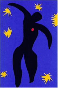
Children readily relate to shape. Coloring books are mostly about shapes which they fill in with color. On the other end of the spectrum the great artist Matisse was praised for his work doing papiers coupes late in his life. They are considered the final triumph of his career. You have to wonder how much his advanced age, illness, and limited physical ability reduced him to a simplified form of expression. His work is often described as childlike, and I disagree with those that say that no mere child could have created the shape-based work like Matisse's paper cutouts. Too often art is conceptualized to death. Letting yourself see the elemental in the complex, and behold the primitive, is something that a lot of adults cannot do with great facility. A child on the other hand has no problem because in a sense they are primitives.

Shape has a close relationship to line and form. Shapes by definition are two dimensional with a distinct boarding out-line. The other edge is a type of line. Shape will also morph to form as tones are increased changing it from a two to a three dimensional object.

In the images of lilies below it is easy to see how shape evolves into form as shifts of tone and hue are added. Moving from left to right increasing amounts of hue and value detail is added. In the second row the images become more recognizable as the Photoshop Cutout filter's sliders were adjusted to added more detail. There were two filters used in combination Cutout and the Water Paper. The Water Paper filter was used to increase contrast in the original image, and was kept at a constant (15, 60, 80) throughout the series. The increased contrast produced a better shape abstraction from the starting.

The Cutout filter was set to 2, 10, and 3 for the top left image. As you move to the right the Number Levels slider was increased by one for each successive image. The Edge Simplification slider was also in turn lowered by one for each image. The Edge Fidelity slider was keep constant at 3.


There are any number of ways to abstract an image into shapes in Photoshop.The image above was created using the filter Maximum (set to 48) found under the Other filter menu pick.


Shape is different than pattern. In the camoplage example to the left there is a lot of pattern, and the goal of any camo effort is to hide shapes. This is accomplished by using pattern irregularly and by breaking up the outline thereby merging shapes. When you disguise the outline of a shape it disappears. Shape and outline are integral.

Pattern implies a repetition of some sort as you'll find in many pattern recognition tests like the red and blue pattern test below. You are expected to pick which pattern A through F (on the right) best fits into the empty space in the full pattern on the left. Pattern recognition is a large scientific field of study for understanding intelligence, and also for 'machine' learning.

The important distinction for graphic design is that repetition is taught as a distinct design element (to be covered later). Pattern is not called out as a distinct design element I believe for two reasons. First, pattern is typically a repetition of line, shape, color, form or some other element. That is, pattern is made up of something else in a repeated manner, and therefore not a distinct element itself. Secondly, pattern recognition requires quite a bit of cognitive power, a higher-order of understanding so to speak. Shape recognition and the detection of repetition occurs before the higher-order function of pattern recognition

Repetition and shape are the primary design elements in the tessellation design to the right. Together they form a pattern.

The initial pre-attentive appreciation of graphic arts occurs on a more primitive level - a level where appreciation occurs before cognition.

That theory would be an interesting Sensation and Perception research project to prove, and is currently being research by scientists.


What is Visual Gravity & Pre-Attentive Processing
 
A good piece of art or design has a certain power to capture your attention, even if momentarily. Some express that quality as a visual gravity - the power to pull you into the image. An initial attractive force happens before you are aware what the image or art object is, and in fact in the case of abstract art, the image may be relatively meaningless on the strictly cognitive/analytical level, but nonetheless you may be attracted to it.

There is no greater complement than for someone to love your work and not be able to tell you why.

As mentioned, pattern recognition has been studied by scientists for years. What I'm referring to here is something which occurs before that and is now being studied as pre-attentive processing. In laymen's terms, you must first recognize that patterns exists before you can determine the type of pattern. How we do that is by pre-processing visual stimulation categorically in order that higher-order cognitive processes have something to work with.
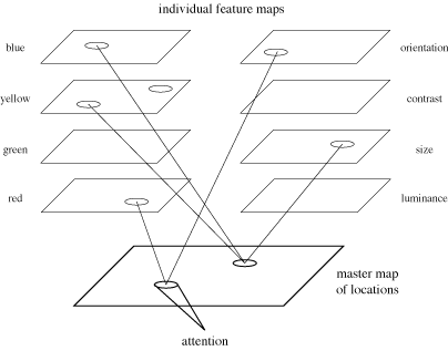
In the diagram to the left there are two sets of pre-processing filters. One for color and another set for categorizing sensation by size, contrast, luminance, etc. The 'master map of locations' can be thought of as our field of view where all the 'filters' map to. Our experience of attention follows after the filters have done there work.

I don't find it surprising that scientists are naming the various pre-attentive filters similarly to the elements of design. Dr. Healey is in the department of computer science at Noth Carolina State University. He has a great web page explaining this in great detail. It is a fun page with a lot of interactive demonstrations. There are also intriguing references to articles such as Perception and Painting: A search for effective, engaging visualizations. His work is published in very exclusive journals by ACM and IEEE. Probably not light reading.

Again, thinking about this from a laymen's point of view. Survival of the species depends on making sense out of vast amounts of visual information and doing it fast and accurately. We can't do a lot of thinking when danger is present. We must recognize it and run. Over the eons our visual system(s) have evolved to detect small amounts of movement out of the corner of our eyes, efficient relative spacial positioning through binocular vision, and separate physiological systems for color and value (rods and cones) to name a few. We don't think about any of these things. Images that already make sense are presented to us. In effect, attentive decisions have already been made. The graphic artist must effectively engage these pre-attentive filters for advantage, and the guidance system is the elements and of principle design.

It is my belief that the elements and principles of design were created intuitively over time, and that intuition is based on our pre-attentive processing systems. These elements and principles help to create images with visual impact, because they assist in organizing image components into a visual hierarchy attuned to our psycho-biology.

I believe that each design element can be used to enhance or distract from an image's visual gravity. Each can be tweaked, removed, relocated, or otherwise reworked to find their proper place in the visual hierarchy of the design. For the most part, all design elements initially work on a subliminal level (during the first milliseconds of visual sensation) in an orchestrated effort creating a visual impact (or not creating as the case may be). Those milliseconds of pre-attention affects us, resulting in our gaze lasting seconds or much longer based on the how strong the visual gravity is.

Attention is fleeting, especially in this age of over stimulation. Capturing attention is the ultimate goal of graphic design, then comes the message/purpose you were hired to deliver or desire to express. But that's only possible if your image has enough initial visual gravity - otherwise, they will just turn the page.

All that said, there are other more higher-order reasons why we might gaze at an image such as shock, puzzlement, sex, comedy, the grotesque, etc. Those too are techniques to call attention to an image, but those are in the realm of the cognitive experience for the purpose of entertainment, education or other purpose. An image that has both pre-attentive attraction, and its message/purpose is also engaging, then that image has full visual gravity.

We will get back on track to talk about the design element shape via digital tools. But first, here is a fun illustration of a type of visual processing failure (Complements to Dr. Healey's page mentioned above).


When you mouse over the square an animated gif file is shown which is composed of two images alternating by a flash. They are exactly the same except for a slight but significant difference. If you saw them side by side you would immediately see the difference, but because they are 'blinking' (like your eyes do) the result is difficulty in determining what is different. This is called change blindness.


In case you are not seeing the difference I'll publish the answer at the bottom of this post... when I'm finished.

.... to be continued.

Sunday, August 25, 2013

The Elements of Design via Digital Tools (Part 2 - Line)


A.
Line - Engravers are experts with the the design element line.  It is interesting in the engraving above we see the use of line but also point used in series to form lines, illustrating that point, like a pixel, can become all things graphic.

Some of my earliest learning experiences were through the imitation of the old masters. The German artist Albrecht Durer was one of my favorites. In images labeled A and B to the left and the closeup below I drew Albrecht himself sitting in a melancholy mood contemplating an empty sheet of drawing paper. A technical pencil was used for the engraving-like lines which I loved to 'bend' around cloth and simulate wood grain. It is too bad that my interest ran out before I finished the drawing.

Before I ventured out to do my own composition I did a composite of three of Durer's engravings into one image. A portion of that drawing labeled C is shown below . This drawing is significant personally  because creating it kept me sane during my stint in the service and was largely responsible for my acceptance into Carnegie Mellon's Fine Art program.

Attempting to stay true to an engraving style I only used line in the drawings. (These images are photographs of photographs of the original drawings resulting in a lose of detail.)

B.
 C.
Moving right along into the digital age the image below will be used to create variations illustrating the use of line as a design element. It is the image of the county court house in Vinton Iowa my wife's home town.

 The image processing plug in for Photoshop called Thredgeholder created the image below. I own version 1.2 and the controls are fairly simple. The goal is to reduce the image to black lines which you can later color in to create a watercolor or pen and ink effect.

There are sliders categories of  Luminance, Saturation and Hue, and two sliders per category for Threshold and Contrast. By moving the six sliders you can eliminate color and detail, leaving just  outlines tracing around areas where there are differences of luminance, saturation or hue found by the plug in.

In the case of this image the outlines were created on a separate Photoshop layer. Once the outlines were completed a mask was placed on that layer to allow some of the original image to show through. A layer was also added above the outline layer where some additional wash-like color was brushed on. This plug in is inexpensive and does the job, but as you'll see the Topaz Labs Simplify product is much more versatile.

The next two images were produced from Topaz Simplify. In layman's terms Simplify breaks an image down into pieces based on distinctive areas. Distinctive areas are based on shifts in hue, value, and pattern. You can control through 16 different sliders how Simplify discriminates between one area and the next. This will be illustrated in detail throughout this series. For now, the goal was to produce a line drawing. The 16 sliders are broken into three broad categories of Simplify, Adjust and Edge. The simplify set of sliders control the size of each area (large blocks or small detail). The adjust set of slider control the sensitivity Simplify uses to determine area boundaries based on hue saturation and value changes. The edge set of sliders control how the edges of each area are depicted in the result. 

In this case we wanted a line to be drawn around each defined area. As you can see in image D the large pine trees were filtered out to be one large area and a line drawn around the tree. There are a few areas within the tree where the blue sky shown through and they were depicted as separate areas with lines drawn around them. If strong contrast of value are found then a line would be drawn around them too. The a contrast is strong then the resulting lines are darker.

 D.


In image E all of the 16 sliders were the same as in image D except the type of delineating line was switched from edge to line. The following is from the Simplify manual.

Where the Simplify and Adjust tabs form the “meat” of the image, the Edges tab plays an important role in determining the size, shape, and color of the edges in an image. This can affect the final result in many different ways.

In this case switching to line caused Simplify to 'see' many more boundary areas to draw lines around. Of course using Photoshop you can have the best of both by using Simplify on several Photoshop layers and masking out on each layer what you don't want to see in the results. Through this layering method you can add or subtract to the final image endlessly by processing many different Simplify sessions into one final image.

 E.

In order to produce this type of line drawing the Simplify set of sliders were off by setting Simplify Size, Feature Boost, and the other sliders to 0. In the Adjust section those sliders were set to 0 for Brightness and 1 for all the rest. In the Edge set of sliders Edge Strength was set to 0, Simplify Edge .3, Reduce Weak 10, Reduce Small .2, and Fatten Edge 0.

The Line Type of which there are 8 types was set to Mono Line Fine for image E and to Color Edge Fine for image D. That was the only change between the two images. As stated in the manual the type of edge you choose will significantly change the result especially when you are retaining color in the final image.


In the above image Photoshop produced a nice effect using the menu path Filter, Stylize, Find Edges. However, there are no controls for this filter type. The building is nice, but the tree's color is off as well as color in other areas. The colors could be corrected using adjustment layers, but the general lack of control in Find Edges is very limiting indeed.


The image above was created in Photoshop by more advanced methods as describe by WaterColorGirl on the Wet  Canvas site.

Here is the 5 step process for converting it to outline.
1. Convert the image to grayscale or choose Image-Adjustments-Desaturate.
2. Give the image more contrast by going to Image-Adjustments-Brightness/Contrast and adding contrast.
3. Apply the edge-finding filter by going to Filters-Blur-Smart blur. Set the Radius to 5 and the threshold to 20 and the mode to Edge Only.
4. Invert the lines by going to Image-Adjustments-Invert.
5. Use the eraser tool or a mask to get rid of any extra lines.

This process yields a similar result as image E produced by Simplify. However Simplify has many other advantages as we'll see as we develop this image into its final form in future posts.

There isn't much you can't do with Photoshop if you happen to know all the tricks, and are familiar with obscure uses of features. For example, who would have thought to go to the Smart Blur filter to create an outline of an image? Blurring an image seemingly has nothing to do with abstracting an image to a sharp outline. In step 2 I used Curves instead, because I know that Curves is much more controllable than the Contrast/Brightness adjustment. As a matter of fact some advanced Photoshop uses will use Curves as their main adjustment control for hue shifts, tonality control, saturation adjustments and many others.... but that's the point. You don't need to be a Photoshop nerd (and spend the money) if a smaller set of easily understood controls are present in Topaz Simplify.

That is a major point to this series. Topaz Simplify gives you control of the elements of design in a quick and easily understood format, and at a fraction of the cost, and it is a Photoshop plugin for those that need that level of additional control.

 In this example a group of pink lilies on a green background is used to illustrate how the contrasting foreground and background colors help to generate a nice very nice outline around the flowers.

The pistol and stamen structures have a good contrast of value which adds in their delineation too. An accidental but nice effect is the fact that the lines resulting from hue contrast are stronger than the lines on the interior of the flower where the contrast is mostly value/tone based.

I controlled Simplify's lines by only using the controls in the Edges Type section. All the options were deactivated by setting the sliders to 0 with the exception of Contrast set to 1. Then I did some fine tuning by changing the sliders in Edge Type. Of particular interest to me was the creation of very fine lines on the inner petals which could be controlled by setting Edge Strength to 1.5, then moving the other Edge Type sliders to the desired position. In the case of the image below : Simply Edge .42, Reduce Weak 22, Reduce Small .16, Fatten Edge 0.

Now that I had the sliders in a position where Simplify creates an outline I saved the settings as a preset which can be used in the future to instantly turn any image into a line drawing.


Of course line like point can take many forms. In the image above Painter was used with a brush type that painted a series of lines for each stroke. The best way to use Painter is with a tablet and pen so that naturalistic strokes can be drawn. In fact, without a pen and tablet you lose much of the nuance of Painter's ability to create stokes which actually look like they were done with traditional media; not to mention the expressiveness of the directional movement of the lines which is impossible to capture when using a mouse.

The trees were drawn with a swrilling pen motion and for the rest of the image straight lines were drawn across the page. The brush type was Real Fan Soft from the oil brush collection. The Dab Type  was set to Camel Hair. The Real Bristle set of controls were also used with settings of: Roundness 100%, Bristle Length 5, Fanning 100%, and Height 85%.

I set the background layer to a color I liked so it looked like a sheet of cream orange color paper. When texture is covered as a design element I will use Painter's ability to imitate the paper's tooth or grain which is advantageous when using pastels or chalk 'brushes'.

In the image below Photoshop's Colored Pencils filter was used with settings: Line Width 4, Surface Pressure 7, Paper Brightness 48. Photoshop, of course, also has brushes you can customize, but my personal preference is to turn to Painter when I want a brushed look. The brush variation controls are far superior. It is also a bit harder to get the colored paper look with Photoshop's filters, but could be managed with some advanced layer and masking magic after the Colored Pencil filter is run.

When using Photoshop's filters there it is also much harder to touch things up. If you wanted the same line quality but also wanted to erase or add stronger blue in some areas it would be difficult to imitate the line quality with a Photoshop brush when manually drawing the same type of line. In Painter because you are drawing (via cloning) the image yourself you can easily go over an area filling in more detail or stronger color. You can even erase by simply setting the brush to the same color as the paper, and then drawing lines over an area to effectively 'erase'.


To finish up this post on line here are two very different approaches to the use of line as an expressive element.

The image to the left is by Andrew Gibson. Images like this can be done by using Photoshop's Displacement filter. Just Google Photoshop Displacement Map and you find some good tutorials.

My suggestion is to choose two images that by themselves ares fairly simple. In this case a torso professionally lite with good tonal variation, and the other image is of zebra stripes. If either image is complex with too much detail , messy background, or other distractions, then the combined image will be unrecognizable.


I did this drawing back in the early 80's using pen and watercolor. I usually did drawings like this after too many beers.

I can recall from my Carnegie-Mellon days long discussions about the confidence of the line. That is, an artist should draw with little hesitation shown in the 'mark'. It should be in a free flowing style.

I agree to an extent that an artist should be confident is laying down their image. It shows a definite maturity and clarity of inner vision of what should be placed on the page and how. But that's when the drawing is somewhat about expression.

The first few images of this post come from a different place and different purpose... and there we go again about purpose (see past posts).

In the next post of this series we will explore shape as a design element. 

Tuesday, August 20, 2013

The Elements of Design Via Digital Tools (Part 1 - Point)

Point - Point is the most basic of the elements of design. To start this post off I'll go back in time to when I began my study of image making over thirty years ago. This is a pen and ink study of pointillism. I used a rapidograph pen by Koh-I-Noor and I'm guessing the size was about a '0'. I also did the same study using colored inks and decreased the size down to 00 and triple zero. The results were strikingly realistic.

Point, of course, is the subject of the the Pointillist Impressionist painters. There is a lot of visual color mixing theory behind what they did which if you were inclined to be true to the art style you would study. However with digital tools you can accomplish much of the effect with very little effort.

In Photoshop the following tutorial from Robin on Yahoo Answers will do the job.
1. Open your image, select the layer, and tap Command J (ctrl J on a PC) that copies the image onto a new layer. This keeps a pristine copy of the image, which is always a good thing. The general rule of thumb is non-destructive editing!

2. In the color swatches at the bottom of the toolbar, set the background swatch to whatever you want for your canvas color (white, black, tan, etc.)

3. With the new layer selected, go to the menu item Filter, then Pixelate; and then choose Pointillize. Set the cell size to whatever you want. When you like the effect, click OK.

If you run the filter multiple times, you can get very interesting effects, that mimic a brush loaded with more (or less) paint.

You might also want to experiment with using a different blend mode on the layer that's been pointillized. For instance, try switching to Hard Light, Overlay, or Luminosity.

As you might expect there are multiple ways to accomplish this in Photoshop. With this approach there are no brushes or any chance to interact with the process other than to set sliders or a check box and then see what happens. Not really a creative process as compared to Corel Painter.

For illustration of what you can do with Painter I'll use a photo I did of gords. The only change I made was to turn the shadows blue for contrast to the predominantly warm colors of the gords.


The image below is done in Photoshop as described in the tutorial above. It looks as though you are seeing the gords through a screen. Adobe has made very little enhancements to their options under the Filter menu over the years, but that is where tools like Painter and the Topaz suite show their strengths.


In the image below it took all of two minutes to create the effect in Painter. The file was opened and in Painter terms a clone was made of it. Then a special brush called a Splatttery Clone Spray was used. In Painter there are a hundreds of brush types enabling you to alter an image endlessly to a style of your liking. You can also create your own brushes A brush in Painter you can think of as a combination of a media (watercolor, oils, pen, pencil, etc) and a style using that media. You truly can create your own style of digital art. It will take considerable time to master Painter just as it would if you were learning to paint with traditional media. The image below is a little less photographic compared to the Photoshop rendition.


Painter has much more control over the dot size. For example, maybe you felt that the above image was too lose. You could tighten up the dots just by changing the dab type from airbrush to pixel airbrush as seen below. There are literally and endless number of controls.


Although the above image has fine detail and is sharper it isn't very expressive. The images to the left and below have more of a traditional media feel as though done on colored paper. Greater textural effects can be created by choosing a paper type from a list of optional papers, and then using a pastel or chalk 'brush'. Once a paper is chosen you can then chose how rough the tooth is. Combining paper and pastel options in addition to the ink application seen here would yield a very traditional look. If cloning is turned off at the end of the process then you can add your own free style strokes too.

For this variation a clone was made then set to gray scale to remove color. The brush type was the Airbrush Fine Spray and the dab type was Liquid Ink Airbrush with the stroke set to Single. When using this dab type you also have additional controls in a separate menu just for Liquid Ink. You can control the volume of ink per dab/stroke, the smoothness, and the randomness of the size along with eight other options.

In the close up the random size can be seen which helps give it a natural feel. One nice feature is the ability to erase using the same brush if you over work an area. Erasing in this manner is like picking up the dots you applied, and then reapplying the dots after you've make adjustments to one of the many controls.


In the variation below we are moving from point to the use of line where the brush type used is called Impressionist Cloner. It is easy to bring in more or less detail from the original image into your cloned image just by going back over the clone with a larger (less detail) or smaller (more detail) brush.


Going one step further into line I got carried away with Painter and made the gords look fuzzy in the image below. This was done by using the Pepper Spray brush on a cloned image and setting the dab type to flat and stroke type to single. The stroke or dab size was set to 27. I then painted in the white/blue areas with the Furry Cloner brush. It is easy to get carried away with Painter and forget what you're doing. In this case this image has little to do with point as a design element. I just got into making fuzzy gords.


The following is an example from Topaz Adjust. The Topaz products are not so good for the point design element. They excel when focusing on line, shape, color and other elements. In this image in order to bring out points of color the tool's controls had to be pushed to an extreme, resulting in an image that may not be useable.


Each element of design should be used for its own strength depending on the purpose of a project. The gords are about color, but they are also about texture in all those bumps and ridges. Using Painter and focusing on point as the design element the following image was created.


In this image texture and points are merge into a single design element, making it appear as if the gords were painted onto a heavily texture fresco. A neat effect if that was something that needed illustration as part of a travel magazine add. Point in this case are point of texture sometimes forming lines/ridges.


This variation is again looking at point as points of texture. In this approach Painter did its own thing by using the Auto-Painting feature. Auto-Painting is simply Painter applying the defined brush strokes itself according to what brush featues you have chosen at the start of auto-painting. In this case the Van Gogh Cloner brush was active along with a dab-type of circular, a method of cover, and a size of 5.3 with Min Size of 47%. On the Impasto window Draw To was set to Depth and the Depth Method set to Paper. Auto-Painting was set to Smart Stroke Painting and Smart Settings on.


What was cool with this effect was that while it was doing its auto-painting the 'paper' seemed like it was boiling as it built the relief look (see video). You can use auto-painting to quickly see how the brush settings work. Once you have an effect you like you can save all the brush setting (which there are many) and a new brush is created for that effect. You can then easily recall that brush style later and reuse it.

What is point anyway. Isn't the sun a point of bright light in the sky? The sun is the largest object in the solar system and hardly a point like a point on paper. But that is the final point. Because point is the basic design element it can become anything... like atoms of the design world.

In closing this blog on point one of my favorite illusions is about the point that is missing, and I promise you will not miss the point, because that is the illusion... seeing something that is not there. You only see the black dots when you don't look directly at them. They are bashful.


Thursday, July 25, 2013

Bird Feeder Bling


Every now and then you must surrender to your inner craftsperson. I think anyone visiting recent craft fairs and farmers markets has seen bird feeders constructed from found glass objects. I call them Bling Feeders! Most of them are made from old Mason jars which hold the seed and the jar's threads fit poultry feeders that can bought at serveral online retailers, or, if you have a Fleet & Farm nearby you'll find them there.

The images above show my construction using old glass stuff I had left over from my closed studio. The beads were experiments in color I did when learning torch working using Bullseye glass. The large glass shade was found on Ebay. It is supposedly an Art Deco period piece... who knows, I just thought it was cool.

Here is a close up of the beads. It was fun making them just to see what glass does under extreme heat. The color, texture and shape combinations are endless.

Talk about an experience of pure color! I loved the flowing molten glass and its endless potentiality. The vividness of the colors and the translucence of glass have such a sparkle that is only second to gems and polished stone.

A lot of my glass adventures ended in realizing the critical limitation of scale when working with glass. Large scale glass is technically complicated, extremely expensive, and is a team effort.

I just was not satisfied in working in miniature was my conclusion.

Here is another Bling Feeder I did after we moved into our new house in Iowa. This ceiling fixture was too nice to throw away so I added the same type of Mason jar, drilled a hole in the jar for the supporting hardware, and used silicon to glue the jar to the light shade.

The fancy top was a glass base for a candle. It also had to be drilled in order for the hardware to support the whole structure.

Construction of either was fairly easy. If anyone wants info on the process then just put a comment on the blog post and I'll respond the best I can.

In the image below you can see crimps used to secure the bead string to the glass light fixture of the first Bling Feeder shown above.


Friday, July 19, 2013

Glass Powder Painting Revisited


I did these glass panels several years ago and only now have gotten around to framing them. These were created through the process of applying glass powders to a sheet of glass, then tack fusing it in a kiln. The glass is heated just enough that the powder sticks to the glass sheet base.

I closed my glass studio over two years ago now. I don't miss it much. Glass work is expensive, very labor intensive, dangerous to some extent, and not very forgiving. The glass powders are very harmful to your lungs. Unlike painting or using Photoshop on images when doing glass working it is very difficult to redo or correct your work. Once the glass is baked there is no going back. If you are a control freak like me you are never happy on the first try, and you end up with a lot glass that is basically scrap.

There are all kinds of styles and approaches when working with glass of course. My explorations drifted towards powder painting because of the control you have over how the colors are placed. As time progressed Bullseye, the company that makes the glass, began to produce an increasing number of the colors as striker colors. Striker colors are those that only show their true color intensity after they are fired. Before firing they are very pale or even near white. As you can imagine it is impossible to powder paint if several colors you are using are not their true color when arranging the powders. Couple this complication with the inability to continually adjust the colors and their arrangement when 'painting', and you have a medium that is not very easy to work with.


As you can tell from my prior post I love to work with texture. In this close up you can see how the powder is laid down, creating a surface that makes you want to run your finger into it. Powder painting is a lot like the sand paintings done by Tibetan monks. In the image below a mandala is being created. As far as I know no one has as of yet used glass powder and a kiln to make the mandala permanent. Then again, maybe that would break some sort of rule or symbolism such as the impermanence of all things. Some day maybe I'll get back into glass and create a mandala as a fundraiser.


Fine Tuning an Image (Image Making Series - Part 7)


Back in part three of this series the classic Principles of Designs were outlined as were the Elements of Design in subsequent posts.  We ended up with the image to the left after doing some basic cropping and discussion of what still needed improvement. In this post graphic art tools will be used to further illustrate the image making process.

A fairly unassuming image was chosen for this series to show that by thinking in terms of design elements and principles any image can be enhanced. In part three several questions were asked and problems pointed out about the image.

It lacked style, was not very creative, and much of the story is about texture... but what texture did I want to emphasize? The tree of course, but why? In relation to what? Is texture it, the whole story, or is there something else?
 An image's purpose is how these questions are answered and the director of how the principles and elements of design are utilized. Without a purpose it will be difficult to create a visual hierarchy to guide the viewer's attention. In advertising an image's purpose is integral to the ad's message. In fine art the image's purpose is dependent on the artist's intention to communicate an idea or personal vision or expression. Sometimes images are just studies of technique as is suggested here that the tree may be a study in texture.

Using the elements of design I can begin the process of abstraction which I define as focusing on pieces of the whole (design elements) and enhancing them for emphasis of the image's purpose. If the tree is a study in texture then increasing contrast is one method of creating more visual texture as seen below. A closer crop was also use to bring out more detail. I find that cropping will continually change as you hone in on the image's purpose.

At this point there is increased texture in the grass and tree, but they are equally strong and competing for attention. The grass could be deemphasized by blurring or defocussing it in Photoshop, but my personal preference is to build a complementary relationship and not just an opposing one like focused and not focused elements.


In the next blog post I will cover in detail the use of the Topaz Labs set of image editing tools as they relate to the elements of design. In the above image I used Topaz Simplify to abstract the background. It is now softer, more colorful, and less focused. The impressionistic treatment complements and brings out the texture of the tree which now stands higher in the visual hierarchy, and this is what you want if the subject is a tree in a field and not a field with a tree.

The tree is fairly smooth however. Using Topaz Clarity and Adjust I can increase the texture to the desired level as seen below.


In Photoshop each change to the image is placed on separate layers. In this case I was able to increase the texture of the tree, but did not touch the rest of the image. Everything on the enhanced tree texture layer is masked out except for the tree itself, thereby leaving the grass untouched. These are small images and a lot of detail in the actual file cannot be seen.

The images to the left show close ups. The top does not have grain, and the bottom has some grain added through the Topaz tools. The level of grain can be controlled to mimic film grain or increased in visibility to the level of creating its own abstracting effect. In this case I wanted the grass to be a little less smooth and to have slightly increased visual interest when the image is viewed close up.

Topaz Simplify is an very controllable regarding  the amount of simplification applied to an image. In the case of the image above the tree may be standing out too much as though it were plopped down into an impressionistic painting. But the goal of bringing the tree forward as a focal point was accomplished.

At this point it is a fine tuning process. As I worked the image I wondered if this was still a textural study?. Texture is what initially drew me into the image, but what about the initial point of creation when shooting the tree? It wasn't about texture really. I felt there was a story to be told. The image has been improved, but is that enough? Did I miss the point, miss the story, and the initial purpose of the image?

The tree was integral to the initial shot. It stood strong, but was dead. It was alone in an open field. It was colorless and shadowed within a colorful sun filled context. It was gnarled, hard, and rough in a soft landscape. But it was the fact that it was dead with life all around it that struck me, standing like a gray tombstone demarcating a line between death and the life all around it.


Paintings do not have a sound dimension for the most part. The subtle sounds of wind blowing through the grass and crickets and cicada singing were auditory memories only. I added a just hatched cicada to the image above in keeping with what was becoming the theme of the work. As I reentered the original experience of being in that field the addition of the cicada brought me back to story telling. As this theme developed I noticed that the field needed further deemphasis which lead to the last cropping of the image shown below. The tree and the cicada are now equal and integral to the story, and the focus needs to be on them.


I suppose the story is just the old circle of life story.  Birth and death playing out their parts continually. The tree is still prominent, but in working the image I felt that texture wasn't enough. Something else was needed to create a conceptual higher order of interest. The cicada is a Taiwanese variety, and is located on a rule of thirds node. It is also visually bordered and held central by the trunk on the right the shadow on the left and the dark branches at the top.

The image came a long from the the original shot shown to the left. I suppose the image's purpose began with story telling, then the journey lead to an interest in texture to create a visual impact, then I came back to story telling again.

The texture in the tree is striking, and there is enough but not too much visual interest left in the grass. I'm not sure in the end however that the image stands on its own. I believe that it may make a good illustration in a book, but for me it wouldn't be one that I'd print as a work of art.

This post focused on the design element of texture and to a lesser extent color. Cropping and abstraction were used to bring the subject to the fore, creating a proper relationship between foreground and background. Abstracting the background help to separate foreground and background and put the subject its proper place in the visual hierarchy. Contrast was discussed in both texture and color (or lack there of in the tree). Directional movement or visual flow exist in the relationship between the cicada and how it is framed by the elements surrounding it.

In the next post all of the elements of design will be discussed and how they can be manipulated by the Topaz set of tools and Photoshop.