Saturday, March 8, 2014

What is Art?


The title asks What is Art? There really is no answer of course. At least no single answer, and even a set of answers which try to pin down something half definitive would just lead to more discussion and argument. We all know that art and craft are different, but then what of high-end craft? I think we regularly think of artisan one-of-kind ceramics, for example, more art than craft.

There is one definition that has rung true for me over the years. David Pye wrote several books in the late sixties which I bought, because I was learning wood tuning and David did some very interesting turnings. In his book The Nature and Art of Workmanship David lays out a scholarly dissertation (published by Cambridge Press) on the distinction between objects made with an element of risk, and objects made that are completely determined from the start.

The distinction isn't between mass produced items and handmade items, rather, the distinction is between how the process is carried out. Is there an element of chance, risk, or some step in the process that isn't fully determined from the start. Mass produced items must be fully determined in order for production to be efficient. Turning pots or making any craft item can also be fully determined from the start in order to produce items which the public can afford... ditto for 'art'.

I'll let David speak for himself....

Workmanship of the better sort is called, in an honorific way, craftsmanship. Nobody, however, is prepared to say where craftsmanship ends and ordinary manufacture begins. It is impossible to find a generally satisfactory definition for it in face of all the strange shibboleths and prejudices about it which are acrimoniously maintained. It is a word to start an argument with.

If I must ascribe a meaning to the word craftsmanship, I shall say as a first approximation that it means simply workmanship using any kind of technique or apparatus, in which the quality of the result is not predetermined, but depends on the judgment, dexterity and care which the maker exercises as he works. The essential idea is that the quality of the result is not predetermined, but depends on the judgment, dexterity and care which the maker exercises as he work. The essential idea is that the quality of the result is continually at risk during the process of making; and so I shall call this kind of workmanship 'The workmanship of risk : and uncouth phrase, but at least descriptive.

What I pick up on in his definition is that it is not the object itself which is categorized, but the process. This idea of risk in your work intrigued me years ago and still does today.

Beauty isn't art. Beautiful things are mass produced every day. Design isn't art. Design is a process whereby we typically want a predictable end. I've spent a lot of time (as can be seen in past blog posts) thinking about design. I love design. I love to make beautiful things, but for me at least that's not art. It is following a recipe. You use the principles and elements of design and you end up with something pleasing. With a little practice anyone can follow a recipe, and maybe improve on it too.

This post came about  because I was looking through some of my old sketch books. The image at the top of the post is from a period many years ago where I was working with ink, markers and pens. Mostly black and white. Quite the opposite of what I'm doing today. In those days everything was undetermined. I would pick up discarded things laying in the street, cut stuff out of magazines, combine drawings from different places, whatever. Anything that caught my eye was potential content. For example, at the bottom of the above drawing is a bunch of glue globs and whole pieces of wheat.  There's a feather in the middle and on top a discarded pack from Kertek cigarettes. Why?... who knows.

Is it art, or, is my more recent work of abstracted pastoral barns and trees art?

I think it is only worth asking... when I'm done with a piece am I surprised by what was created? How much of the process was out of my control (that is, who/what/how was control applied). What risks did I take in the creative process? Where did I push into a new direction? Am I just repeating myself?

These types of questions probe into the creative process, constantly seeking to make it motivationally authentic, more exciting, more challenging, and leave questions of art for others.
 

Saturday, February 22, 2014

EyeCandy - Kilnformed and Torchworked Glass Information Site


I put up my first web site well over ten years ago using Microsoft FrontPage. The focus of the site was my adventures in glass fusing, and teaching various glass fusing techniques. I did this for a number of years and almost made a go of it. But for various reasons decided it was time to move onto other things. I posted a blog post here a few months ago on the Elements of Design in Glass Art, and it has been one of the most popular posts. Because of that I've decided to point glass enthusiasts to my old site which has tons of information on glass fusing.

You can find EyeCandy at http://www.jimbolesdesigns.com/eyeCandy/index.html

There are lots of informative pages and links spread throughout. It was going to be the contact place for my students at the Chicago Avenue Fire Arts Center in Minneapolis, and for my community education classes.

You will also find a lot of glass fusing information at this blog, if you go back to 2010 and before (see links at the left panel) .

Hope you find the information useful. Enjoy!
 

Wednesday, February 19, 2014

Graphic Arts Workstation - Part 4 : Monitor Banding and Other Tests

I received several emails with questions on the DreamColor display. I'm very pleased with it. It has, as I've said, eye-numbing clarity and brightness. Yea, maybe a bit too bright. I'll have to look into that some more. It is easy to tune it down a bit. At this point in my life I'm not as hung up on following absolute standards like ProColor or whatever you prefer. I just don't have the professional nor amateur need to do so. And also as mentioned in prior posts. my right brain has managed to take almost complete control of my home PC. Consequently, I have little patience any more for just sitting around tuning my technology unless my right brain says it needs something.

But, nonetheless, am perfectly willing to help out others who may want to dive deeper into a topic or just ask a few questions on just how good the DreamColor is. And to that end I'll explore the topic of gradation and banding. This is a pet-peeve area for even my right brain. I hate watching movies on my 45 inch plasma and see all those gradations in the shadows. It drives me nuts, and ruins the whole experience... albeit momentarily.

The last place I want to see banding is in Photoshop when I'm processing one of my images.

So with that in mind I decided to do some tests. I propmptly went into Photoshop CS4 64 bit version and did a black to white gradation... don't laugh. Of course, it was all sorts of  banded. Yea, I could dither or a half dozen other smoothing tricks, but that's not really the solution is it.

Besides, if I'm sharing ideas with others we need a standardized methodology. So, wha-la... just Google gradient test and you'll find some. Without too much critical thinking I choose the site http://www.lagom.nl/lcd-test.

I then ran the gradient test on both my DreamColor Display and my Asus ProColor.

First the ProColor

The card is the NVIDIA Quadro FX 560 with the 307.45 driver & bios 5.73
128Meg memory, 1920 x 1200 x 4 million color , 24 inch display
It is currently set to the factory settings for the Adobe RGB mode.

The Lagom gradient test was absolutely smooth. But the blacks were not as rich as the DreamColor. For the Black Level test I could see all the squares except the first one. The background did seem to be absolute black.

Interesting... I ran the test from the DreamColor laptop onto the ProColor external monitor, basically letting the Laptop's newer card drive the external monitor.

The results were very similar. The ProColor is indeed a nice monitor for the price.


Now for the DreamColor

The card is NVIDIA Quadro K610M with 312.56 driver
8.8 Gig Memory, 1920 x 1080 x , 32bit color deptt, 17 inch display
Using the HP Calibration Kit mentioned in prior posts it is set to :
Tone Response Curve : 2.2
ICC Profile Version : 4
Achive Luminance value using video LUT's = True
White Point : x: 0.313  y: 0.329
Luminance: 120
Gamma : 2.2
The Display Preset : AdobeRGB

The visual examination of the Lagom gradation test was a bit disappointing. There is one somewhat distinct band on the very dark end. It is where it going from the darkest possible to some small variation above that where it banded one time. Everything else is perfectly smooth.

The other test of note is the Black Level test. On that test I was not able to see the squares 1-10. That seems pretty significant, and I guess I now have to play with the calibration, or, just make manual adjustment to try to get something better than that.

If anyone has other requests for testing let me know.

Further Testing The Following Day

Yesterday's testing left me with a couple of questions. The first question is the preset I've chosen. AdobeRGB really isn't the best to be working with when you consider the advances in technology. The other question that remained was the driver for the Nvidia card. There are a lot of reports that banding is a common problem.

To resolve the second question I downloaded new drives for the card from both HP and the absolute newest (nonOEM) driver straight from Nvidia. Neither driver fixed the banding, and the nonOEM driver made the HP Calibration Kit dysfunctional with an error message "“Failed to read the prescriptions" and promptly became unusable until I reloaded the new HP driver.

I'll wait for HP to create a new driver to fix the banding.

I also upgraded the test.  For this series of tests I used a 10bit gradation file which can be found at Image Science (http://www.imagescience.com.au/kb/questions/152/10+Bit+Output+Support)

I followed the instructions to insure that Photoshop (PS) was set to use a 10bit file, and it was. The results were a consistent banding across the whole gradation. If I changed PS from 16 bits per channel to 8 bits the banding went away completely.

Just for grins I booted up my old 32 bit XP system with Photoshop on it to see how it would display the gradation on the Asus ProColor. That system has an Quado FX 560 with 128Meg. It actually wasn't that bad. It is running a 32 bit version of PS (versus 64 on the zBook), and the bands were slightly less pronounced and there were fewer larger bands.

Using the HP Mobile Display Assistant you can quickly flip through various color space settings. I ran through them all and non of them had a dramatic affect on the banding. The DCI-P3 seemed to clear up banding the best, but it was also the darkest, and because of that harder to see if there was banding.... and, of course, not a color space for a photographer to use.

All in all, my right brain is beginning to get a little tired of this, because it is all about color lots of variation, and lots of detail.... and all this banding issue is never going to show.... never.

I don't think I'm heading for a Rothko depression period where I'm enveloping myself in fields of darkness.

But nonetheless, the left brain wants to know that my investment is performing properly... whether I ever need it or not.


Friday, February 7, 2014

Pittsburgh Holiday Photography

I spent Christmas in Pittsburgh this year visiting the family, and came away with the following Pittsburgh Holiday images. Any large older city like The Burg has dozens of features which make the city unique. I captured a handful during my brief stay.

The first image is of Heinz Field home of the Pirates. I reworked the image using Topaz Simplify  image editing software . I downloaded the newest version, and it has even more features than the ones I outlined in prior posts. I'll cover the new features in a future post.

Click on the images to enlarge the image
(In IE 11 once you click on it you can click again to enlarge further)


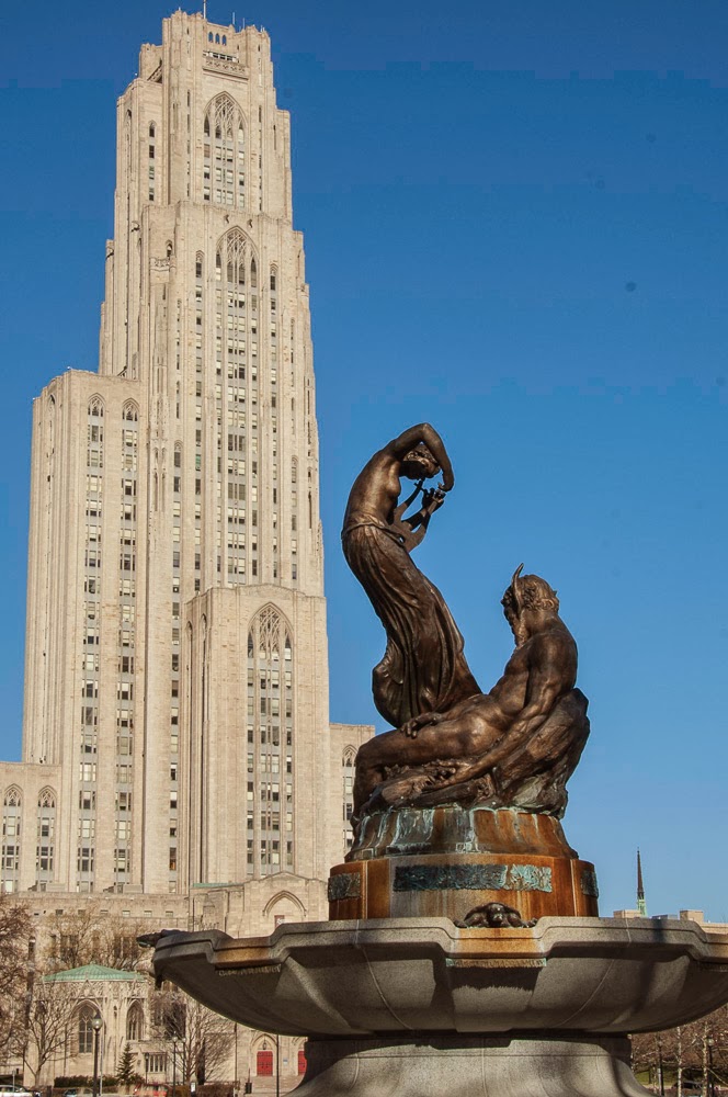
The next image is one of my favorites of the trip. It was taken on the1st floor of Pitt's Cathedral of Learning. I recall studying there are few times during my freshmen year, but there weren't any comfy chairs to camp out on. Before going to Pitt I studied a year a Carnegie-Mellon's fine art department. In art history class they discussed the cathedral, and mentioned that Frank Lloyd Wright was appalled by the structure. Yes, I can see his point. It is a throw-back to another time, but nonetheless is a magnificent building for any university to own.
 
 
Here are a few more from around Pitt. Again, click to enlarge to full size.


The next image is the bronze of Roberto Clemente outside of Heinz Field. He is famous in Pittsburgh, but not so much around the country unless you're a real baseball fanatic. He was a great player. One of the best in fact, but because the Pirates rarely made the playoffs, let alone the World Series, he didn't get the recognition he deserved. He was part of the 1971 Pirates World Series team, and was the MVP of the series. As a kid I would try to do Clemente style 'basket catches', and his famous spinning-twirling throws from deep right field, challenging the runners at home plate.

Imagine twirling like a shot putter to gain momentum, and throwing the ball from deep at the warning track dead into the catcher's mitt at home without a bounce. Unbelievable!
 
As far as this image's development... I emphasized the bronze, warming it up in contrast to the rest of the image. That was done by simply using a Photoshop warming filter and a mask on that layer so that nothing but the statue was affected. Then in Topaz Adjust I neutralized everything else, that is, lowered the saturation levels so that Roberto (the subject) would stand out. As a finishing touch I tinted the sky slightly purple, the complementary color of orange (bronze in this case).


Then there are cathedrals of another sort all over Pittsburgh. Going back several generations, each Pittsburgh neighborhood had their own church or synagogue, etc., and the style of the church illustrated both the ethnic origin of the community and its economic standing. This one is of the Immaculate Heart of Mary parish in the Polish Hill area. What is significant for me in the image is that this is a typical image of Pittsburgh's houses on hills. Whole neighborhoods are often cut into the sides of hills which at times are as steep as ski jumps.

Polish Hill is directly across from Troy Hill, in the distance where I grew up, and in the far distance is Spring Hill. You can't tell but there are two deep valleys in this scene. The valley below Polish Hill has the Allegheny river flowing in it, and the valley between Troy Hill and Spring Hill is called Spring Garden.
 
This type of topography results in the common Pittsburgh saying "You can see it, but you can't get there from here."
 
 
Like many older eastern cities Pittsburgh has many hidden gems like the Heinz Chapel pictured below. Henry Heinz, the founder, was often called The Great Provider for producing his 57 Varieties of canned goods. My Dad, who worked until retirement at the plant, was the great provider for our family. It was olfactory heaven growing up near the plant where you could smell one of the 57 varieties being brewed on a regular basis. Today much of the plant has been converted into high-end condos and lofts. The sign of the times.


Getting back to the holiday theme, and a cathedral of another sort... the following images are from PPG Place. Pittsburgh Plate Glass has a huge presence and history in Pittsburgh. Over the last twenty years, downtown has taken on a whole new feel as slowly but surely what is old and dangerously decrepit is being replaced with new things to do and see. These images are of a skating rink in PPG Plaza where you can rent skates, and whir around what seems to be a grand ice palace from Disney's Frozen movie.


The following are more images of the Plaza and of Market Square which has changed over the years from a pigeon-ridden mess, and has been transformed for the Christmas season into some kind of imaginary garden of marketing delights. You can barely see small wooden houses in the right most image. There were dozens of these making up a temporary mock village all over Market Square, advertising and selling whatever could be sold on those cold winter days.

The image to the left is PPG Place standing sentential-like over the Christmas display including a metal globe tree in the foreground. This image is tinted in an antique postcard-like approach, giving it a slight fantasy feel. (OK... more than slight)
 

I love glass, and I could have spent several hours photographing PGG Place, but it was a miserably cold day and the best shots I could manage are below. These two images show my tendency to break an architectural image down into simple pattern and shape. Glass is cool to work with because you have a definite Mondrian-like framing structure, but within that you have free-form color and texture in the reflections as seen in these two images of grid and reflection.


I like the next image because it takes the grid even further by flattening it out, and complementing the central structure which is really the subject of the image. The rule of thirds is evident in the layout. The image is obviously split vertically into three sections, and the brilliant red tiled dome is in the upper third horizontally. Red is obviously a design element too, where the most stark red is in the subject with subtle green and aqua accents, digitally accentuated of course.


In the next image form is the dominant design element, but without pattern/shape/repetition covering the surface it would be a boring triangular layout.

 
I have to include one quintessential Pittsburgh image, that of a bridge and the city. There are dozens of bridges over the Monongahela (the Mon) and Allegheny rivers. In this case I used the old photography technique called framing to put a frame around part of the cityscape. The paint on the bridge isn't quite that yellow. I enhanced it to build contrast to the rest of image and to emphasize the arch against the blue sky. A vanishing point is a very common technique to guide the eye down a path (the road) into the secondary subject (the city), and then back again when your eye travels up the bridge support, leading you back to the arch.


The Union Trust Building is the subject in the next image which I'm sure Mr. Wright would say is antiquated as well. I'm a fan of Wright, and have visited Falling Water on several occasions. I've marveled at his progressive ideas, but nonetheless the Union Trust is a stonemason's wonder. (See the additional image in the collection below.)

Wright built Falling Water for the Kaufman family whose department store was a grand place back in-the-day, when going downtown to shop was an event.... before the advent of malls. I remember thinking it was sooo cool to be able to order a peanut butter and jelly sandwich cut into petite little squares at Kaufman's Tick-Tock café when I was six or so.


Not to ruin the holiday theme... The following images are of one of several war memorials located on the North Shore area near the Steeler and Pirate stadiums. The Del Monte building is in the background. I think Del Monte owns Heinz, or, maybe more correctly Heinz and Del Monte are just part of the ever growing multinational conglomeration. This memorial is a circular set of metal pillars, holding large sheets of glass containing images of war, including The Bomb going off (not seen here).

Yes, I was thoroughly impressed with what is happening in downtown Pittsburgh and along the North Shore with its museums, casino, tram, and a lot more.


Monday, January 20, 2014

Graphic Arts Workstation - Part 3 : DreamColor Calibration

Just as short note on the calibration I've done so far. Firstly, as mentioned in prior posts my idea of calibration and the whole color correction topic is being approached from an amateur (albeit advanced) point of view. I just want reasonable control over my two monitors, and for the prints to be reasonably close to hue/tone I see on the monitor. Paper/print will always look 'worse' than a monitor that's a given, chromatically correct light booths, special scopes, all the rest really isn't my concern. I just don't want a huge surprises when I go to print.

That said, the DreamColor Calibration Kit is doing what I want thus far. I have an Asus ProArt and the DreamColor Display. I expect them both to be calibrated to the same standard. In the past I used Adobe98. I'm thinking, since I'm mainly concerned with photography that I should change that to the ProColor standard. I haven't done that yet however. What I have done was to use the calibration unit on the DreamColor to dummy it down to the Adobe standard, and that along with setting the Luminance level down to 120 definitely did bring the DreamColor down to the Asus level of performance... a bit.

The native DreamColor display is eye-numbing beautiful. Incredibly crisp, and the colors were the most intense I've ever seen, while at the same time not be over saturated or off balance in any detectable way. But as we all know, print is another story, and I'll have to do some serious adjusting to get the DreamColor down to a point where it is reasonably close to print. I'm thinking I'll print to Canson's Arches Aquarelle which has given me fantastic results in the past. It has a really nice watercolor feel, and that is what my final image needs. Something that looks/feels liquid when it was put to paper.

I used the default Adobe98 color space, set luminance to 120 and left gamma alone at 2.2. The DreamColor is still much brighter than the Asus, but I have not calibrated the Asus in over a year (yea, I know, tisk, tisk), and that was done with the old X-rite Monaco colorimeter which is no longer supported. My next step will be to calibrate the Asus using the same settings, and using the DreamColor kit. I'll report on that next time.

Saturday, January 18, 2014

Graphic Arts Workstations - Part Two : DreamColor Calibration Solution Kit


Now that the DreamColor Calibration Solution is working I'll provide a few snapshots of the process. The starting screen gives the option between  Easy or Advanced seen only if you happen to be running dual displays. You don't get those options if you are running the zBook without a second monitor. I would suggest not having a second monitor attached during your first run of the calibration software.


The image below is what you will see if you have only the native LCD as part of the mobile workstation.


There are several Display Presets you can choose from (sRGB, rec709, rec601, Native, and DCI-P3). I chose AdobeRGB and did the same for RGB Primaries, but for the primaries there is a custom option allowing you to chose your own RGB settings. White Point gives you the options of D50, D55, and D65, and custom where you can set it to your preference. Luminance and Gamma are also adjustable and X-rite has a nice tutorial on the standards for those settings found here. You will need to register an account and logon. If you're a beginner to color calibration and the total issue of color control you will find the videos interesting. Some of the videos are free.

I was concerned that in the left side panel it said HP ElieteBook instead of zBook, but apparently that is OK. After you have set the values you want that's just about all there is to it. Mindless... just like my right brain likes it :)


The image above is the last before calibration begins. It is simply telling you where to put the DreamColor colorimeter. The calibration process takes about four minutes and finishes with asking to name and save the profile. That's it.

This is a very simple process and does not have all the options that you will find in more advanced color correction software and hardware options... but then again, unless you're a professional with a very large and costly project in your hands this HP solution may be all you need.

For example, the unit does have an ambient light diffuser as seen in the white spot in the image below. However, the software does not take advantage of that. I suspect maybe future upgrades will, or, it is just an artifact of the colorMunki heritage which will never be used in the HP variant.

That's it for now. I may show some of the performance differences between the Asus ProColor which was/is considered a decent monitor, and the DreamColor monitors.


Graphic Arts Workstations - Part 1 : HP Dreamcolor on zBook 17


I recently bought a HP zBook 17 inch. The primary attraction was HP's DreamColor technology. As you may know in past years obtaining color accuracy on a PC was certainly possible, but something left to professionals. I'm just a serious amateur in most respects. I work in IT professionally, and some of that carries over to the other half of my brain in the evenings and weekends when I have time to play with color, design, etc.

A little backstory is that I've been using HP products primarily for my right brain activities, because my left brain told me that HP was a dependable company and that I could invest a considerable sum to have a system last for ten years or even longer. Yes, I would need to upgrade software and hardware, and the initial costs would be high, but over time I would have a stable state of the art system that my right brain would enjoy. I mostly use my left brain at work, so I don't want to come home and mess around with technology. When at home my right brain just wants to play.

I will be exploring over several posts if the strategy of spending $7 K on a graphic arts workstation is worthwhile for a serious amateur who expects that system to last ten years, or, because technology changes so quickly is buying/leasing newer smaller systems a better approach.

My bias is that I don't want to be on a payment plan. A pet-peeve of mine is that all of corporate America wants you on a subscription, payment plan, lease, club, or any method they can think of to obtain regular payments from you. So the question becomes, can you purchase a system and expect it physically last, perform well, keep up with technology changes, and actually be cost/time effective over a ten year period?

As a side bar... I mentioned left/right brain. Over the years I took several tests to see where my gray matter stands on the great divide between the arts and science. You can do a test to see for your self if your left or right dominated. In my case I've taken several of these tests and I fall in the middle. The screen shot below is the result of a test you can take at Test Yourself.


Now back to the subject at hand.... There will be two focuses in this series of posts. The first is my old system which is an HP xw8400 tower workstation which has been faithful to me for over seven years. I've been upgrading it over the last few months in preparation of removing XP and loading Win 7 as a fresh install.

The other focus will be the new zBook, and the adventures of using a state of the art mobile workstation with a 17 inch LCD that is professional quality. The screen image at the start of this post is from the HP Mobile Display Assistant which is a default tool to control the DreamColor display.

My first impression is that the Display Assistant saved me from my first mishap. As mentioned, I hate spending time on technology when I'm home. So I bought the zBook (with the DreamColor option) and ordered the HP DreamColor Calibration Solution kit thinking I needed to calibrate the new system as I did for my Asus ProArt LCD on the xw8400 workstation. Out of the box the calibration solution did not work on the zBook. Oh, it worked alright, turning the display a dark green (no red or blue at all). I couldn't get the system back to the default factory setting.

All of my old tricks of knowing where the icc/icm files are (C:\Windows\System32\spool\drivers\color), or, using the Windows Color and Display utilities could not reset the monitor didn't work. (even if you know the tortured path of tabs to get to the proper place that actually does something VS what you think makes sense). Apparently, the DreamColor architecture stores the calibration within hardware settings, making it nearly impossible for the average person to change it.

That was a huge disappointment. HP collaborated directly with X-Rite to make a calibration unit specifically for DreamColor. It is based on X-Rite's ColorMunki product, but the 'brains' have been altered for HP's DreamColor. Since my right brain saw X-Rite, HP, and DreamColor all in one sentence (at several web references) I just assumed it would work with the zBook out of the box. Bad assumption.

The documentation was nearly nonexistent. Just a few small help screens, and certainly no manual to be found. Nothing on the X-Rite or HP sites that I could find for the zBook DreamColor regarding technical details on how to use the calibration system. I resorted to doing a full system search on the zBook for the keyword DreamColor. That is how I found the HP Mobile Display Assistant. You would think it might be on the Start Menu somewhere as an installed program, and it is under All Programs > HP Mobile Display Assistant. Being new to my zBook (even if I saw that menu option) it didn't sound like a what I was hunting for.

Anyway, once the display assistant was started it was just a few clicks to reset my LCD to factory settings, and from the first looks I might even send back my calibration solution kit. I'm not sure that it will be useful or necessary in my situation. I just need reasonable color calibration control, not perfectly objective metrics for all the display settings.

My goal is to be able to print 30x40 prints on an inkjet and have the color be reasonably close to what I saw on the screen, and I'm getting the feeling that the Mobile Display Assistant will get me there. There's even a user manual by god!


You can see in the above image of the Settings screen that there is an option to load your desired color space at application startup. I've chosen AdobeRGB mostly because that is what I'm use to in producing reasonable prints from Photoshop and Lightroom. The DreamColor display is actually capable of producing a larger color space than the AdobeRGB standard. You can also set the preferences to show a startup icon on the desktop. Something that should have been default and would have saved me from finding it indirectly after hours of suffering with a dark green display.

Anyway, that's the nickel tour. I'll post more technical stuff as I dig into the zBook's DreamColor display.

Shoot me any questions you might have on the HP zBook or the DreamColor display.


(I just took a few minutes after this post to look at the Mobile Display Assistant. Not exactly full featured and the 'manual' is just a bunch of one liners. Oh, well. The Technical Support button took me to a third party company who I suspect would like to sell me something. I don't know if they will address my question regarding why the HP Calibration tool didn't work on the zBook. More later)

Now three hours later.... I decided to call HP to see if I could get the calibration unit fixed, or, just return it. I thought the odds of getting a fix were nil so I would be returning it. However, because both the zBook and the calibration unit are under warranty I actually got through to a support person who had a clue. He didn't know about my calibration unit, but he did know just a little about DreamColor technology. He confirmed that there is no manual available, and we just decided to download he latest HP Mobile Display Assistant (ver 3), and reinstall the calibration software (ver 2.2) which I had uninstalled.

He did a remote connection into the workstation, and went through the install and upgrade for me. Then we ran the Calibration Solution software again... and it worked!

I now have an adobe98 icc generated, and of course, it is also now part of the firmware of the DreamColor architecture, and it looks great.

I think this is the technology progress that my right brain expected. It should have worked out of the box.... and it did after a day of frustration and help from HP. Calibrating a monitor for the needs of an amateur like myself isn't rocket science. Yes, years ago it was a bit of a pain on the old Sony Trinitrons, but we are making progress, right? And this little adventure shows that we are.... one small step at a time.