Sunday, December 5, 2010

The Power Of Craig's List


Over twenty five years ago I started my glass journey doing stained glass when glass fusing was pretty much unheard of. I took a community education course in the copper foil method and made a sun catcher. I then embarked on my first project, and oddly enough I didn't do the copper foil approach. I always over build and over do things. I guess I was afraid to build a 25 by 40 inch panel using copper foil, and chose brass lined came for the bottom and zinc H channel for the top.

Not knowing very much as far as proper technique I hand cut each one of those polygons individually. There are easier ways of course. I didn't have a came saw and all the zinc for the polygons was hand cut on a little wooden miter box. The project design jumped onto my sketch book one day. I'm not sure what I was thinking about, but I liked the design and I was determined to finish the execution.... even if it killed me. The brass lined lead came was a challenge, because it wasn't very flexible and I wanted a very free flowing pattern on the bottom. Because I over build things I didn't want regular came which would have been more flexible and WAY easier to cut.

I ended up calling the piece SpaceTime.  The name came as an after thought after the design was on paper.

Anyway... it was a good experience. I made two more stained glass panels of my own design and then found glass fusing.

After having it around for all those years it was time for it to find a home. If we are going to be moving then I'm going to need to find a home for a lot of my stuff. I placed an add on Craig's List and just a few days later I got an email asking about it. Yea sure... I thought to myself. Some joker from China or Russia wants me to get involved in some rip off scheme. The query turned out to be genuine and it sold several days later. The new owner is very happy with it and had it mounted in a window as seen above. It is a night shot. The bottom glass is actually clear.

So maybe I'll do some more marketing for the stuff out in my studio. I got tons of stuff that needs to find a home.

Sunday, October 31, 2010

Fall Reflections


Fall always brings on a sense of melancholy for me. The ending of summer and in Minnesota the beginning of a frozen landscape. Colorless for the most part and uninviting. I always thought that I might get into cross country skiing just to get outside and active during the winter months, but that never happened. In the past I spent all of my free time in my studio doing glass projects and enjoying the heat generated by the kilns and torch.

Not sure about this year. I don't have any major projects in mind and I've been so busy the last few months that I don't have an area of exploration in mind either. I quit my IT job over a year ago and recently got called back to do some consulting work. It is hard to say no to consulting wages so I accepted their invitation. And as a consequence I have been teaching in the evenings and working days as an Oracle database administrator. Thank god that 50% of my community education class have been canceling. Otherwise I would be working 16 hour days continuously.

All of that makes me long for my Vermilion vacation that was just a few weeks ago. It seems a long time ago already sitting on the sun drenched dock, enjoying my beer and taking the picture posted above. My IT work will only last a short time, and I can then go back to concentrating on my teaching and various artistic adventures.

I think this year I may start up my crucible kiln and make more spheres, but this time their destination will be to become paperweights, because I don't plan on creating another sculpture series for them to become a part of.

Other concerns however are causing many in my family to reflect on more important issues. Both my mother and mother-in-law have been seriously ill. Thoughts of moving to a small town, career changes, some of us thinking of retirement etc., are now intertwined with daily living. There is no definite plan for change as of yet, but change will come.

Teaching has been a wonderful experience, and had I been mature enough to realize it when attending Carnegie-Mellon's art program I would have made teaching a career option. Right now teaching at local art centers is the best I can do. It has been personally rewarding, but financially not so much. Going back for a masters  now and then hoping to land a good position would be a huge investment that I'm not prepared to make at my age and position in life.

Working with nonprofits which was the initial focus of this blog (Designs For Good) became secondary to  teaching which became a full time adventure. Moving forward I would like to rework that initial focus back into what I do... but there is that word 'moving'. When we relocate that will change everything.

Monday, October 4, 2010

Color & Texture On Vacation

When you've found which of the elements of design (color, form, shape, texture, line, pattern, etc) are central to you it may be confirmed just by looking at your past work. I'm always looking to make sure I'm on the right path and not just on some deviation or momentary tangent. Before I spend years studying something I want to be sure it is worth the effort and central to what I am innately sensitive to... what truly resonates with me.

In my Introduction To Glass Fusing class I go over the elements of design and ask the students to think about which of them they feel comfortable with and might enjoy exploring. I often use line as an example, because we can easily think of line alone as being boring. Who would spend years just studying line, is the type of question I often get. Then I mention engravers and their eyes perk up. There is a world (and a lifetime) of exploration in each of the elements of design. Being sure you are on the right path saves you from a lot of wasted effort.

This point came across to me this year with our yearly vacation up to the north county of Lake Vermilion Minnesota. What a wonder world of color and texture. Texture always abounds in the sticks, but in the fall the full glory of color is flaunted about like a peacock in heat.

I  can recall last year spending the week just studying texture during my photo sessions, and now that makes sense to me a year later, confirming by more recent commitment to color and texture. There does seem to be an ongoing sensitivity and preoccupation with those elements of design.

These digital art images can show some level of texture, but it is not until you see them at full size (16x24 or so) that you actually see the real texturing done via digital processing. Several post back I talked about this in my Psychedelic Jello post.

The colors were at their peak this year during our visit so I had both color and texture to work with in abundance. The reds where stunning in the maples. Yes, of course I always push the saturation in my work, but the reds you see are really not that far from natural. It was nearly a psychedelic landscape at times.

I also have begun using polarizing filters a lot. In the past I hated to use them because they make a slow lens even slower. Now that I'm doing strictly digital art and not photography there is no problem with setting the ISO to 800 and sometimes higher. The small amount of noise is lost or corrected during digital processing.


Levels of abstraction is also a consistent theme in my work. The more levels there are the more interesting it becomes to me. Choosing the point of view on the subject is the first level. I like to shoot at unusual angles and often lay on the ground with a 12 mm lens. The wide lens is the second level of abstraction since it is an unnatural point of view.

Next fall I may take a balloon ride in the MN bluff country and shoot from the top-down POV. That will yield some really interesting work, but it might also be really expensive. Not only for the ride, but I may also need a fast and long lens in the 200 to 400 mm range. Fast and long lenses are costly.

Good composition is always important no matter the type of shot. My cropping and layout is fairly typical using the rule of thirds, framing, leading lines and many other conventions.

Building the contrast of the image both in tone and hue is the next layer of abstraction. I like my images with a controlled amount of highlights and deep shadow, giving an image a greater sense of depth than it may have actually had. Contrasting hues in another technique for building a sense of depth. Split toning by hue is a contrast technique of making shadows colder than normal (blue or violet tinted) and highlights warmer (orange or yellow tinted), yielding a visual sense that might otherwise be much flatter.


Pushing the color saturation (plus or minus) is my next level of abstraction, and at the same time looking for increases to the natural level of recorded texture. Texture exists on multiple levels. Firstly, on the highest level there is purely a psychological sense of texture in the scene via its interpretative texture. We see leaves and water and know they are different textures.

On the next level there is a texture in how the image is constructed. Pointillism, impasto, and engraving are three totally different approaches to building an image. The digital process I use breaks an image into areas of patterns and lines on a very small scale. Optionally, there could be no lines or thicker lines which bound larger or smaller areas. The detail and type of abstraction of the original photo is very controllable and there are infinite aesthetic choices.

In the print world there is the substrate itself which adds yet another layer of texture.Today there are many optional output surfaces for digital art, including canvas. I'm currently in the process of deciding on my substrate for the next series, but it probably won't be canvas.

I'm not sure where I stand yet on the 'photo looking like art' discussions. I'm not a photographer, but I use a camera. I'm not a painter, but I like to abstract my images. I don't want my digital art to look like a painting or a photograph. The images above do tend towards looking photographic, that is, until you look closer and it becomes clear something else is going on, and much more interesting. On the other hand if I abstract them a lot, then they will look like a photo trying to be a painting.


I should probably just ignore the discussion and do just what I like doing.

More images in this series can be seen at this slide-show. More will be added in the next week or so. A few of those will then be candidates for the next stage of  abstractions consisting of: compositing, blurring, smudging, masking, adding painted areas, etc. Because it is time consuming, only a few will be chosen for the next stage. This will result in images where every square inch has been through the aesthetic mill and polished to my liking. My liking for the day of printing at least, because the path forward always makes past efforts... well, passe after all.

Friday, September 3, 2010

Handmade Tile Association


My teaching adventures at Have Kiln Will Travel have taken up a lot of my time over the last six months. I'm beginning refocus on the commercial and home decor side of things as of late.

I've joined the Handmade Tile Association who are "a diverse group of independent members and volunteers, including: handmade tile and mosaic artists, tile historians, tile setters, tile showrooms and galleries, tile organizations, material suppliers, educators, design services, and tile related fields all across the United States". 

My ad in the yearly directory will feature of one of my room dividers (seen below). I hope to have time in the coming months to focus more on glass art for home decor and larger commission work.

The association's web site is a good resource for interior designers and for those who are looking for something special - something to take a project to the next level and the right artisans to do the job. Check it out! You can see a selection of my tiles at the tile gallery on my web site. The gallery shows only a few of the possible designs, colors and textures. I can achive any home decor objective and design style.

Monday, August 30, 2010

Edible Landscape - Pyschedelic Jello


I recall being in a gallery eavesdropping in on a conversation between two collectors. The one was describing her favorite painting style where the paint is put on so think that it looks like pudding. In the case of the landscape above it reminds me of psychedelic Jello. For one, the water is doing all kinds of rippling in two different directions like a large platter of Jello would do. Then there are the crazy saturated colors not found in nature, but strangely enough in some of the food we eat.

As I've been discussing, I think for once the subject didn't get in the way of color exploration. I find myself often staying too loyal to the original, whereby it acts as some sort of constraint which I constantly measure my efforts against. It's a crutch I need to free myself from.

In this landscape study from a Lake Vermilion photo, I put texture explorations in the back seat and focused more fully on color as I pushed the saturation sliders further than I ever did before. That and some vodka produced colors that I wanted to dive into. Wouldn't it be absolutely crazy if there was a place you could go to for a short visit where the world was colored like this landscape. Of course we couldn't live there, because our eyes would burn out from over sensation.

Maybe that is what a painting is for?.... no.. not to burn our eyes out, but a place to go to for a short visit.


I love how the grass and shoreline turned out. There is enough texture there to keep me from feeling the need for more throughout as was done in the petunia study a few posts back. Both the Topaz Simplify and Clean plug-ins where used multiple times on different layers, along with Photoshop layer masks and other layer adjustments. When you click on the image the enlargement will be close to what the final 20x30 print will look like.


I don't think going psychedelic will work with many subjects so maybe the lesson learned is that I need to choose subjects which 'allow' me to be as nonrepresentational as I want to.

Tuesday, August 24, 2010

Scott County Art Crawl - Oct 9th


I'll be participating in the first ever Scott County Art Crawl. Read all about it and see some of the work at http://bit.ly/bRQ7Dh.

Come by for a feast for the eyes, mind and tummy... I'll have great beer, wine and hors d'oeuvres.
You can preview a lot of my work at http://JimBolesDesigns.com.


DIRECTIONS

4640 139th St. W.
Savage, MN 55378

952 388 3762

Once you found your way to county road 42 (Egan Drive) running east and west through Burnsville/Savage/Prior Lake you can use these directions.

If heading EAST on county road 42 away from Prior Lake, do a U-turn at the Sonic restaurant (the Joppa-Glendale intersection with a traffic light), and head west on 42. Take the first right turn lane (Natchez) after U-turning at the Joppa-Glendale intersection. The Natchez turn comes up quick. Then take the 2nd right (139th St). The studio is a brown building with a white door and trellis in the front, and is to the right of the white brick ranch-style house at 4640 139th St.


If heading WEST on county road 42 from Burnsville take the first right turn lane (Natchez) after passing the Joppa-Glendale intersection (has a traffic light). Then take the 2nd right (139th St). The studio is a brown building with a white door and trellis in the front, and is to the right of the white brick ranch-style house at 4640 139th St.

From downtown savage (Savage Art Studios)  take 123rd east to Lynn Ave. Take a right on Lynn and continue on Lynn (which becomes Glendale) until to come to county road 42 (Egan Drive). Follow the directions for WEST listed above.

Here are several maps. The top map shows the location of my studio and you can zoom around to get a large view. The lower maps show the locations of the Savage Art Studios, my studio, and the studio of Chuck Burton another local glass artist.


Monday, August 23, 2010

Pseudo Triptych


The wonders of Photoshop.
Needed to see what three of my digital art pieces would look like together. So why not make a digital display of my digital art... digital lighting and all. Couldn't resist using a heavily textured digital wall to go along with my recent texture posts.

Monday, August 16, 2010

Abstraction Distraction


One of my ongoing themes as of late is determining just what level of abstraction I'm comfortable with in the process of downplaying illustrative or representational imagery. The image above is a macro shot of a white rose. Just the tips of some petals are in focus, and some softening was added too. This image is almost the opposite of what I have been exploring. There is almost no color and texture, and maybe that is why it intrigued me. Softness is a texture, and the warmness and softness together would make a nice background for a cosmetic ad or some such.

Having nearly no detail I put the image into the Topaz Adjust filter just to see what would happen. I choose all the controls to bring as much detail into the image as possible and created this sandstone-like interpretation of the rose. Of course this is the other extreme being all about texture now.


I didn't want to totally lose the softness so a mixture of both is what I went for in the image below. A little bit of Photoshop layer combinations, masks, and other adjustments resulted in this dark dreamy landscape. Kind of nightmarish I think and far removed from the original clichéd cosmetic ad background.


Funny what will be created if you just let impulses guide you. I'm attracted to this image, but afraid of it too on some level. I certainly wouldn't want to turn into another HR Giger. A nice diversion at this point. If more of these dark specters appear I'll have to pray to Monet to save me.

Friday, August 13, 2010

Color & Texture Part Two

I put away my pastels. I was making a real mess of my studio with pastel powder flying everywhere leaving a layer of dust thick enough to write your name. At $5 a stick there has to a cheaper way to experiment with color so I'm back to Photoshop.

The image to the left is a study of color contrasts. It's was hard to keep the screaming yellow in the background. It wanted to jump forward and overtake the subject, but in this case the strongly silhouetted petunias do seem to stand firm against the yellow onslaught. It helps that I down-keyed the yellow to yellow-orange somewhat (do you remember 'Screaming Yellow Zonkers'?).

Equally important for me is visual texture which is not visible in these reduced size images.  In the enlargement to the left I'm please by the harmony and balance of color. The more you enlarge a section of the image the more abstract it becomes. The interplay of shape and positive and negative spaces begin to replace 'flowers' as the subject, and that too pleases me since I don't like the portrayal of a 'thing' getting in the way of the color and texture which is the true subject.

In this next enlargement the texture of the 'painting' begins to appear especially if you click on the image to enlarge it further. It is only at this point that I begin to feel comfortable with the work. I spent a lot of time getting the digital brushes and filters to produce this naturalistic texturing. I actually spent more time working the texture than composing and coloring the image. The image started as a photo. The yellow in the background is a field of Black-eyed Susans. I couldn't resist the color contrast with the petunias and had to stop to shot them. Shooting at a high ISO begins the process of abstraction along with a shallow depth of field which creates a yellow backdrop for the purple flowers. The graininess of the ISO setting is the underlying 'cause' of the texture that I develop further with my digital tools.

The finish print will be 20x30 and the full detail of the texture will become evident as the viewer moves increasingly closer. The final image below is closer to the desired overall style. In future work I need to further abstract the coincidental subject (flowers) to bring the actual subject (color and texture) more to the fore even when viewed from a distance. I may finally be pleased with the overall style once the coincidental subject has been subjugated (so to speak) by the actual subject.

Monday, July 5, 2010

Color & Texture


I suppose that my interest in the use of glass powders isn't just about color. When I decided to fire my glass to a maximum temperature of 1210 degrees Fahrenheit I discovered I could mix glass powder to any tone, tint or hue without the problem of certain color combinations turning brown. Typically, many warm and cold glass colors when mixed together do not yield a color in between, but instead you get brown. That's because under heat the chemical make up (metal oxides) in glass react with each other. Since the glass granules (fine powder) do not get a chance to chemically interact as 1210, you can actually mix glass powder like you would paint.


Just as important to me I recently realized, is that this temperature also gives a very fine sand-like texture to the glass surface. I like this, because if glass melts together into a completely glossy surface you lose a lot of detail, detail that is necessary if you want the finished work to gain interest as you approach it. Also since most glass artist work very hot and want the gloss look, my textured surface serves as a counterpoint to that general tendency. I like that it is soft looking and inviting. You want to touch it not because it is glass, but because its texture is inviting, something new for the senses. It is really just an expensive sand painting to put it crudely, but because of the intensity of the color and the irregularity of texture, and the design of course, it can be a much more as seen in the April 2009 blog post.

The image above was accomplished with glass chalks and regular glass frit. The glass chalks come in stick form just like normal chalks. The intensity of the warm colors is due to the fact that the chalks are more in the enamel family that glass powder. One of the main characteristics of  enamels is that they are heavily pigmented. Just a dusting of an enamel coating is required for opacity and richness versus around 1/8 inch or more of glass powder to create the same opacity and richness. Because of this the chalks enable a leap into visual color mixing that is impossible with glass powders. From a distance the small specs of enamel visually mix and as you approach you begin to see individual specs. It is the small size of the spec coupled with its intensity that enables the visual color mixing even when very close to the piece. You have to be closer than a couple of feet before you begin to see the richness in detail, detail that invites you in even closer.

The image above is of a 5x5 inch square, and is probably slightly enlarged on your screen.

To create this texture cover your glass with #1 frit. Bake it to around 1210 and hold for 10-30 minutes depending on your kiln. Do not allow the frit to round over, otherwise you will lose the 'tooth' necessary for the chalk in the next step. You now has a 'canvas' to work on. The sharp edges of the frit act as a texture like pastel paper has, cutting into the chalk and holding the chalk to the surface of the glass. Do your design on the textured surface. When your drawing is complete, bake to 1450 until most of the chalk has melted into the glass surface.

Regretfully, the chalk does not act like glass and you cannot achieve a sandy surface. Most of the finished work will be glossy though somewhat textured, albeit mostly rounded over texture and not very sandy. Since you have to fire so high the regular glass frit which was your 'tooth' will also be melted into a mostly glossy surface. That's OK though since the micro fine pieces of chalk still do show up as fine distinct pieces of color and do not melt into a amorphous blend.

I'm sure to use this technique on a future powder painting.

Monday, June 21, 2010

Powder Painting Steps In Creation


The link below is to a PDF file which shows the steps during the creation of one of my powder paintings. For this commission the goal was to create a fertile mountain valley scene. Some of the technical challenges were:
  • The panel had to start at 1/4 inch thick to withstand shipping, and an approximate size of 32 by 19 inches
  • Because of the thickness and overall dimensions long firing schedules were required which made it a several week process to work through all the phases of the painting.
  • I wanted a lot of actual texture in the powder to give a feeling of a mountainous landscape. This resulted in increasing the thickness of the panel in some sections and making annealing the glass more of a challenge. Special care must be taken when a glass panel has varying cross sectional thicknesses.
  • Multiple firings were required to build the texture, while also guarding against the powder turning to glass. Once glass powders turn to glass there are chemical reactions which can 'discolor' the work.
  • Hue shifts had to be planned and balanced with each new layer and firing, because each firing made the underlying layers darker and glassier
In the image above the final stage of the painting is in the kiln and a closeup was taken of the main peak. After 5 firings the peak was standing about 3/8 inch high on top of the 1/4 inch glass. The valley is shown towards the top of the image. I've never work this thick with powder, but was increasingly intrigued by building up layers of powder, then carving into them. My sculptural tenancies were getting the best of me.

The PDF is around 2 meg in size and may automatically jump to full screen mode when you open it. If it does, then to leave full screen mode just hit the Escape key. When viewing the sideshow click on any image to advance to the next slide. The color, as always, will vary from monitor to monitor.

Hope you enjoy the sideshow!

Here is the PDF.

Glass Powder Painting : Part Two


This is the scene of the battle ground. At least that is what it seems sometimes. Over forty jars of glass powders, various sorts of sifters, brushes, other make shift application tools, and the ever faithful kneeling pad. For this exercise I pulled in my vacuum - a little hand held unit in the upper left which was sold at Radio Shack for vacuuming keyboards and computer parts. You can see the texturing at the bottom of this painting done with the vac and brushers. Kind of like impasto painting, but in my case I've learned that it means that I'm just taking things too far.That is, it just really isn't my style. The thickness of the powder is just lay after layer of indecisiveness. It is nice to know that an impasto-like approach is possible, but that is not what I'm after.

This adventure was a battle to get closer to finding my style. You can clearly see the carving effect in the image to the left. The more I worked on this piece, making it increasingly representational, the less I liked it. The image was getting in the way. I found myself studying how to create the illusion of waves trees etc and totally lost focus on color.

This image got dumped in a jar. About 2 and 1/2 pounds of powder which I'm sure I'll use for some experimental purpose some day.

It is too easy to lose contact with why you are doing this in the first place, and for me that is simply the celebration of color. Part of a growing nuisance is that Bullseye is making more and more striker colors. That is, until the glass is fired it just looks whitish which makes seeing the color in your painting impossible. It's like painting blind. I use my fired color swatches (in the top left of the top image) to guide me, but you just can't interact with colors on your 'canvas' if they go on white.

To the left is the 'canvas' after I dumped the image. The painting surface has been texturized by kilnforming it on lava cloth which is a commercial cloth-like product used in the furnace and kiln building industry as a flexible refractory material. When you fuse onto it you pick up the texture of the material, making your glass look like a canvas surface. My reason for doing it was to create a rough surface so I could  try out glass chalk sticks. I believe ceramists have had these glazing sticks for some time which apply on a rough surface like chalk would. However, during my testing the lava cloth surface wasn't fine toothed enough. You need something like a sandblasted surface. But hey! Why not use a white powder fired to the regular powder painting texture. That would be a great surface. I'll have to try that.

The canvas has a integral copper/gold frame. The frame was kiln carved at the same time as the lava cloth was used to create the working surface. So, you have an integrated frame and working surface done in one firing. How cool is that!

So now back to work. Color... pure color.

I love the sensation have having a field of color then dropping in spots of its complement/opposite. Somehow the sensation is exciting. I can't explain it. You have this perfect field of cool blues, violets, and lavenders, then PLOP... you drop fiery orange right into it. My eye goes POP. Then you drop in more. Then add a few drops of yellow, and yellow-green in a way Pollock would be proud.

But that is sooo odd to me. I can recall how I laughed contemptuously during my freshman year at the abstract expressionist. I thought it was pure nonsense.... and that is what it is. It isn't logical right brain realism. I use to worship highly refined drawings, but now run as quickly as possible from any trace of a subject. I just want the kinetic and visual experience unhampered by thought. Just me in motion and responding, and most definitely not illusionary representationalism.

So then... what to do about scale? Yes, I can make little 2x3 foot powder paintings, and what a collection of unimpressive nonsense they would be. Can I really make 8x24 foot glass powder paintings? Yes, of course, but at what cost. Where would I store them. Would any gallery want to display a 500 pound painting - glass is heavy after all? Should I just do regular paintings.... not sure, but I don't think so.

This will require some thought.

Is this really just an exercise in absurdity. As defined at Wikipedia "Aburdism - a philosophy born of existentialism, regarding the philosophical concept of "the Absurd," the clash between the human tendency to seek some inherent meaning in the universe and the human impossibility of finding any".

In my case... to strip everything down, to find the most essential source of motivation, to then engage it as purely as one can, then only to realize that the motivation leads nowhere.

Perhaps when I laughed at Pollock all those years ago it was really not contempt, but rather I unknowingly recognized the absurdity of a painter (and of painting) having gone too far. Pure expression over composition and thought, stimulus-response over calculated technique, sensation over reason.

Am I searching for a middle ground, or, am I beginning to lose faith and will resort to our clinging need of a representational subject?

I am probably taking all this way too seriously.

In the end I trust laughter and play. Does my work make me smile or frown, lighten my spirit or lay it low with incessant investigations and self examination?

I trust that I don't want a subject, but I don't yet know the form I am seeking.

Is color enough?

Monday, May 17, 2010

Glass Powder Painting : Part One


 In  my Designing With Glass class I attempt to relate the classic elements of design (point, line, form, shape, color, texture, etc) to the elements of glass (frit, stringer, slumping, cutting, paste, etc). In a recent class a student told me that she was a shape and color person. This is a very significant step on the journey of locating yourself on the pathway of self expression, because exploring just one element can be endless. Engravers play with line for their whole career. Rothko's color fields were based on the elimination of almost all of the elements of design save color, and he spent all of his final years exploring the raw experience of color.

Being able to identify which elements are central for you enables you to focus on those who have forged the path ahead of you, and who have spent their life's energy focused on a particular use and subset of the elements of design.

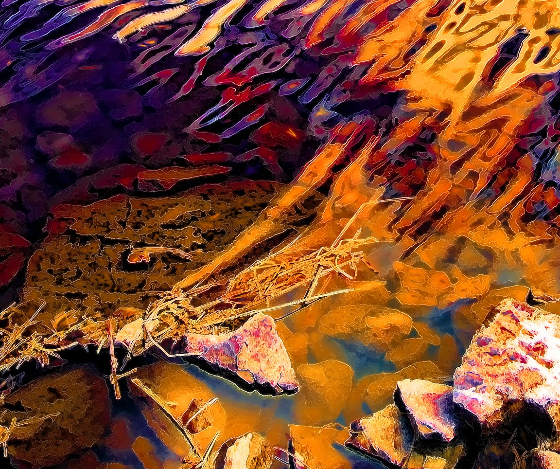
I'm not as brave as Rothko yet. I still need some sense of form, a recognizable subject. Color and color alone as the subject may be where I end up, but I'm not there yet. In the above digital abstraction from a photo the obvious subject is the tree.The abstraction process started by shooting very close to the ground with a wide angle zoom set to around 13mm. The image at the right is the original. I wanted to work with blue and yellow and it is a simple Photoshop process to change the colors. A little Topaz filter plug in magic and there you have it... digital art. (Art or not is a totally different topic)

This spring I visited Minnesota's Bluff Country in the southeast corner of the state along the Mississippi. I've been studying landscapes and have a high regard for the landscape painter Wolf Kahn. The landscape for me is my 'excuse' to lay down fields of color. I've noticed that the more form (the illusion of three dimensional shapes) I bring into an image the less it resonates with me. The same is true for the line, shape, texture and the rest. For me, all of the elements of design must become subservient to color. Wolf Kahn comes close, but he has a predominate formal subject too often, and a lot of his paintings seem muddy IMHO.

I went to the bluff country to find rolling vistas, but found that sitting high in the hills on scenic overlooks gives such a removed, distant and impersonal  feeling. I needed to get into the landscape, be part of it, and not aloft looking down. I traveled to the Amish country of southwest Wisconsin and found more suitable locations within the rolling hills and valleys. One creek valley in particular was strikingly pastoral, even otherworldly as though I had just transported myself into the English country side. These hidden acres nestled in a gentle rolling valley provided a quality of light and shade, sound and echo, and misty coolness totally opposite of the American farms up on the treeless and sun bleached hill tops - farms stripped of every form of variation in the relentless pursuit of agricultural efficacy.

There have been romantic painters of landscapes of course, but I seldom personally experienced for myself what they might have chosen as a subject worthy of portrayal. We can too easily romanticize the Amish life style, even make it ionic, and in some sense make it unreal and removed from our sense of reality. But here they were before me, living in their world hidden, but yet in plan site for the few who would venture onto this dusty and uneven gravel back road.

Driving very slowly I drank it all in. I saw small boys playing baseball with comical over sized mitts covering their hands. They were dressed in the typical light blue shirts, straw hats and black pants which made their mitt covered hands all the more conspicuous. An outfielder waved to me as I drifted past slowly. A school bell tolled only twice, breaking the aural calm momentarily. Children ran towards an unpainted weather worn school house as the bell's chime reverberated and faded into a valley being reborn in these those first days of spring.

I parked my car just to sit and take it in. I couldn't believe that these people lived here, actually passed their lives day by day in such a place of simple beauty. A horse and buggy approached, but was still a long way off as the sound of hooves against the gravel road preceded it. I dared not stare at them as they passed. This is their place, their country, and I did not want to intrude any more than what I already had.

There was only one small road that traveled through this hidden valley. A petite but vibrant creek danced and curved along the roadside. Its gurgling intermixed with the distant echo of a shrill cardinal, nearby chatter of wren song, and the gentle repetitive cooing of morning doves on a branch over my head. Cows roamed and grazed freely in naturally manicured pastures of unattended mixed green vegetation. One bent to drink from the cool clear creek water, making a bull frog leap into the water, ceasing its deep throated mating call. How remarkably different I thought as compared to how the cows lived just several miles away on American farms of mud pens, filthy trough water, and year old dry hay flung about on the baron dirt for them to eat.

I don't think I could ever compress how I felt in that valley into a painting. The experience made me realize that some sort of subject in a painting may be a necessity in order to illicit from the viewer any feeling even remotely like what I felt in that place. Could color alone ever do it without a formal subject?


I took my digital art and made a 36x30 pastel of it in preparation of doing it in glass (see above). The title of this piece is Approaching Autumn Storm. My personal aesthetic tends towards abstracting things to there simplest form. Having a formal subject, as much as I like one, is a crutch for me at this point. I repeatedly choose compositions with a formal subject and I'm repeatedly dissatisfied with the result. This pastel confirmed my feelings. After completing it I have no desire to continue onto glass.

Many of Wolf Kahn's paintings achieve, in my view, the balance I am seeking between a pure color study and a painting with a recognizable subject. The subject serves to accent what is already there without it, that is, fields of color. The subject is a modifier, an enhancement of the underlying color study which is actually is the true subject.


The photo for this digital art piece (above) was taken in the Amish valley. Looking at Kahn's work as a guide I should be able to abstract this further into pure color fields then lay in the trees in a very loose manner so to not overtake what is for me the true subject - a joyous feast of color.

So, now onto the next exercise.

Saturday, May 15, 2010

One Year Anniversary : The Meanng of Life

It is not quite a year since I quit my day job and just slightly more than a year since this blog was started. Many of my friends, so they say, are envious of my leaving work, but we all are too well aware of the hazards of not being steadily employed. All in all it has been a smart move, the bank account is still dwindling, but there is steady income albeit a fraction of my IT salary. This Fall maybe a bit overwhelming with teaching engagements almost every day of the week including weekends.

My Designs For Good adventures have changed direction over time. Initially when I was still employed and the bank account was fat, I gave products and services away because that was what I wanted to do, I could afford to do so, and it was good marketing. Over time as I began to expect and need some kind of compensation in return the direction of Designs For Good began to change.

Have Kiln Will Travel was my solution for a sustainable way of using my talents to provide my income while helping nonprofit and charitable organizations raise funds. The fused glass event/class which is the basis of  HKWT has been very successful, more so than I ever thought. My greatest surprise however has been how much I enjoy teaching, and how it feels a natural thing for me to do.

My life long measure of what activities are appropriate for me has been very simple... Does the activity drain me or give me energy. Funny... I remember very early in life how I learned this guiding principle. At the end of summer kids get tired and bored in the autumn heat. Having played their hearts out over the summer the various games just don't seem exciting anymore. I recall sitting in the yard with some friends, and I began to pull out my matchbox car collection which we would regularly play with for long hours in our imaginary city of made up businesses and adventures. My friends looked at me with disapproval and said they just didn't want to play with the cars. My reply, having seen this in myself more than once was - if we just start playing then it will BECOME fun. After playing for ten minutes or so one of them looked up at me and said... hey, you were right!

Watching the ebb and flow of energy in my life has made me what I am. I react to it as it directs my actions. I believe that this sensitivity to one's rise, fall, and realignment of energy is the answer to the age old question of (and hopefully not sounding pretentious) the meaning of life. There are many spiraling deeper meanings and levels to what I just said, but on the most basic level.... if you just start playing.... it will become fun.

Of course having fun isn't the measure of all things. Life is more complex than that. However, the sensitivity to and your ability to be guided by your energy flow is an ever deepening connection between who you are and your potentiality. That is, your ability to become something richer than you are now by bending your will to the energy that you are, and can more completely embody. Hmmmm... Embody is a very appropriate word here.

HKWT has not been wildly successful in fund raising thus far. I have only started that journey however, a journey that will require me to seek out and to work with governing boards of the organizations which I want to help. What HKWT has done - to me - has changed my direction entirely.

When I quit my job I was toying with a half dozen ideas. Photography was one of them. I love picture making and could sit endlessly playing with my digital darkroom. I did nonprofit work by shooting events and providing free prints, my time, and helping with marketing. However, because I was looking for a sustainable relationship many of my ideas didn't pan out once I actually started working on them. You can give things away endlessly, or, what I should say is.... professionally you can't give things away endlessly, and in the end those you work with must value your work, and yes, compensate you for it.

But that's the rub for everyone isn't it. How do you do what you enjoy and get paid for it?

There is no magic formula of course, and the path will look different for everyone. That is why so few find, and more importantly, stay on the path. No one, save yourself, can direct you. The refinement and balance of your energy with the realities of your life is the magic, and a trick you must relearn and perform every day of your life.

I've never been a morning person, and maybe will never be, but lately I've been playing with and somewhat succeeding at getting up early. Why bother? The answer is that the quality of my alertness and sense o f well being is enhanced if I get to bed earlier and don't stay up late drinking beer and watching reruns.  It is a calculated trade off. I enjoy staying up latter and totally unwinding from the day, but that has to be compared to the quality of being in the morning when I get to be earlier. Right now, I'm siding with getting to bed early. Every event, task, and interaction presents an opportunity for realignment.

I still don't know where I'm going, and that's a good thing. For now, I have refinements to make for HKWT, and because of that path I am now becoming a very good teacher.... so they are telling me. I have hopes of being able to pay the bills here forward, and look forward to wider horizons as I mature on this new path. I will remain vigilant towards the necessity of meeting the bills and then growing back my savings.... but dare I say that is only a goal, and not a directing principle which has control of my life.

Strictly from the fun point of view, aka where my highest energy level and excitement is.... I have started a series of glass powder paintings which will be the most grand works I've done so far... at least in my mind's eye, because thus far they have not 'gone to glass' yet. The digital art studies for these can be seen at my main web site. I'm still in process of abstracting the photos. They will become richer in color and more dramatic as I play with the sense of light and color contrasts. I will then take them to full scale pastels, then finally to glass.

Maybe these will open new doors, new departures points, or, maybe they too well be a completion and resolution. It is hard to say until they too have become embodied as their energy embodies me.

Happy Trails To You!

Friday, April 16, 2010

Chicago Avenue Fire Arts Center Fundraiser


The Chicago Avenue Fire Arts Center, the hottest art center in the Twin Cities, is holding a gala event to raise funds in preparation of its opening. Here are some details below. For the full story visit the site at http://fireartscenter.blogspot.com.

We're delighted to announce our next big event, "A Fundraiser to Remember," which will take place on April 22, from 6:00 p.m. - 9:00 p.m. at the Parkway Theater in Minneapolis.

This is one fundraiser that promises to live up to its name! We’re honored to have two critically acclaimed—and entirely unique—local musical acts lending their incredible talents in support of CAFAC: Jazz vocalist Charmin Michelle and Cajun Country musician Kevin Anthony & The Twin City Playboys. We're also proud to present the world premiere of the short documentary about how CAFAC got started.

Friday, April 2, 2010

Art 101 : Stimulus-Response

So I have to wonder... why don't I just paint on glass with stains, enamels and the growing list of new products which enable you to paint on glass just about the same way as you would on a canvas? I don't have a good clear reason for this. I made an arbitrary decision early on that I would use only glass, then inclusions such as copper and mica became acceptable, but I never explored glass paints. Arbitrary boundaries forced me to prob deep into a limited set of options versus a broad ranging 'media of the month' approach, but they weren't really arbitrary boundaries as it turns out.

Over the last year I have been exploring all sorts of glass media options since I will be teaching and there are a lot of fun things out there such as Glassline Fusing Paint, the products by Unique Glass and many many more. These are fun to play with from the design point of view and expand one's tool chest, but they just don't click for me in my personal work - they don't resonate. They seem more in line with the decorative arts. I'm sure I'll find time to explore their potential more fully at a future point.

 This sense of resonance - a sense of appropriateness, a drive to explore, and most importantly an ongoing interplay between the stimulus (the media) and a response to it - is a sort of dialog that occurs and matures over time. That dialog doesn't develop for many media options and types, and for an unknown reason. Does anyone really understand why they prefer one color over an other? Not really. Something resonates or it doesn't. Why do I love glass, but feel compelled to control it's innate showiness? I don't know.

Very odd, but very significant. Where do ideas, preferences, and directions come from? I think some people appear more creative than others only because they are better responders to that which resonates within them. The creative person is simply responding, resonating with an interior stimulus-response dialog. Strange and wonderful things come from this singular dedication to internal resonance.

Anyone can have a favorite color (stimulus), but the creative person responds by playing with it, exploring the dimensions of hue, tone, shade, and tint. Anyone can do simple mathematical problems or crossword puzzles, but it is the creative person that begins to use words in new ways after having explored their attraction to words and becomes compelled for unknown reasons to write literature.

Perhaps what an artists is is a person who has decided to take the path of exploring an internal aesthetic resonance in a very dedicated manner. And perhaps that is also why artists are a bit odd too. To base your life on something as unpredictable as some sort of internal resonance as a life's guide is a bit...well, undirected. After all, I cannot tell you why I like certain colors, why I prefer one texture over another, one media over another, one direction over another. I can say in so many superlatives my 'reasons', but like a black hole you will continually fall into asking why those 'reasons' too. It is very unsettling for us to realize and accept that we don't know the whys and therefor for some of the most essential characteristics of our nature.

Creativity is not an accident. It is actually hard work while appearing somewhat serendipitous, somewhat out of our control, and at times a nasty task master. Everyone has creative potential and we all only realize part of what we can be. Some more than others learn to feel comfortable with the unknown, happen to have the luxury of time to explore, the maturity to ask the right question... or to not ask at all, but just to respond, to resonate.

Thursday, March 25, 2010

Homage to Robert Leatherbarrow

I'm a glass artist, but I don't like glass... well, of course I love glass but from a purely personal aesthetic glass for me is like the dumb blond stereotype - very alluring but with little substance. Some of your hard core fine art critiques see it this way too. It is too easy to make something beautiful when glass is the medium. It actually takes very little skill to produce a nice trinket, bowl, or simple craft item. Another part of the problem with glass achieving a fine art status is its deep roots in the crafts and its focus on functionality over expression. Glass is just too darn utilitarian and beautiful for its own good to be taken seriously in the classical fine art sense. The innate beauty of glass can easily detract from an overall composition if not controlled in some manner.

This might sound aloof or somewhat snooty, but when you spend a lot of time doing something and spend a lot of money on it along the way, I feel you should be critical with what you are doing on your journey. It is all to easy to be misguided and off target with your work. These next two posts explore motivations and directions along the way of my creative travels.

I started my glass journey over fifteen years ago doing stained glass, but very quickly became disinterested in the cut and paste and puzzle piecing process of leading together the interlocking positive and negative shapes.When I started fusing the cut and paste mentality was used more often than not by most practitioners and still is today. So the journey for me was to explore what else could be done beyond cut and paste. Don't get me wrong, cut and paste processes are an endless journey in their own right if that's your path. Just take the work of Klaus Moje for example who some call the grandfather of kiln forming.


I was looking for a more organic or naturalistic look, something along the lines of polished stone agates. My attempts where all failures in early years, and realized that achieving anything close to my goals via kilnforming was going to be a very difficult journey. In the end I achieved the most success through torchwrork and casting, and very limited success in the kiln. Back in the early days of the Warm Glass forum I found discussion of the work of Mr.Leatherbarrow intriguing and spent many hours trying to figure out how he accomplished his free flowing fractured looked, but never did figure it out (see image above). It was a very guarded secret back then. He now teaches the effect, and I believe his students are part of a secret society of Leatherbarrowers. Just kidding of course, but the technique still is a bit of a secret I believe.

Some of the naturalistic effects I did achieve via kilnforming centered around the use of copper, mica, and the use of iridescent glass (images left and right).

Time marches on and paths change. I'm now preparing to start a new series of glass powder painting and have put aside my attempts to duplicate the wondrous detail found is polished stone. Quite by accident however, and partly because of a studio partner's influence, I came across a method to duplicate Mr Leatherbarrow's fracture effect (see below). Far too late for my Circular Obsession sculpture series, but satisfying nonetheless since I don't like failing in the brain teasing exercise of backward engineering what others have accomplished.

 I will be teaching my approach to the technique in future classes. It is amazingly simple. I found that I could obtain fine grain control over the size of the cracks and the overall amount of fracturing. The fractured area can change in color and in thickness,enabling endless design opportunities. Since it is so easy to do I will have no problem teaching the effect, and then the rest of the class will be exploring different ways to employ it and the many other off shots of powder and wafer techniques.


My glass art journey has been mostly about how to create a balance or contrapuntal composition between the beauty of glass and the overall form within which it is was presented. For my Circular Obsessions sculpture series the overall form had to have interesting textural elements, a sense of visual and physical weight, and interesting surface detailing in order to achieve an integral whole with the all too showy glass components of the design.

Having completed many years of kilnforming explorations I'm finding the use of powders the most promising and the least cut and paste like glass process. I now have control over color, gradation, texture, and a free-form physicality of actually applying painterly strokes with a brush at times. I'm finding that it can be a very painterly-like process if you don't mind wearing a dust mask. Allowing the arm to sway, the hand to arc and the fingers to control the flow of powders is essential in experiencing a sense of color in motion as you build the image layer by layer. I hope to achieve something of a fine art quality in my glass powder painting series, and I believe that might be possible, in part, because the paintings will not look like glass.

My series of glass powder paintings will be done on large glass slabs with naturalistic stone-like edging. The boarding edges will be clear glass, and the painting will gradually build in opacity towards the center of the slab. As in the sculpture series I am back to balancing the overall presenting form (the glass slab in this case) with the glass within it (the powder painting). This time however the powder painting is totally unrecognizable as glass. In a very odd way my tendency to control the showiness of glass has resulted in camouflaging its innate glassiness altogether while at the same time, I feel, liberating the artist to use the medium without the typical constraints that glass imposes as a medium

The cut and paste heritage of glass is totally gone, and a satisfying victory on my journey; the multitude of complications of hot working glass are eliminated; and most importantly I can mix any color to any desired hue and gradation without concern of chemical interactions between the colors (when heated), resulting in turning my blended colors to brown.

This Spring I will be taking a journey down the Mississippi to the bluff country of southeast Minnesota. Very early in the spring just as the leaves are budding each tree has a subtly different favor of green forming a blanket of soft pastel tints of spring green. This with the azure of water and sky will form the basis of my next series..

Tuesday, February 16, 2010

Weaves, Tiles, and Painting


There are all kinds of glass working, and many types I thought I would never do. However, now that I'm making a living at it I'm finding  reasons to do things that I would have never pursued before. Glass weaving isn't something I would choose to do for myself. It is a technical trick and one of those gee-wiz techniques that makes you ask 'how was that done'.  It impresses people and can be fun to do, but unless I get the inspiration to push it in new directions I'll just be teaching the technique to students.

Glass tiles on the other hand I'm doing as part of my attempt to break into the commercial area of art glass. I hope to work with a couple of local interior designers as part of their design team where I produce custom glass as kitchen accents and other home decor uses. Any color combination is possible and on top of that I have the whole arsenal of design techniques that go far beyond the commercial looking tiles here.You can see a whole set of more artsy tiles on my main web site
 
The glass powder painting below is a finished product. I showed a study for it in a prior post. I intend to pursue large scale powder painting in the future at the Chicago Avenue Fire Arts Center. I will also be teaching the technique there.

The glass powder painting below took three firings and was my first attempt at layering the powder on over one inch thick to achieve the mountainous look. Brushes, sifters, and mostly my fingers are used to create the design. I call it painting, but it really is more like creating sand art images where by you manipulate the powders in powder form. One of the main challenges to keep in mind as you put the powders on is what the they will look like after being fired. Their prefired color is usually a lot lighter than after firing. It can be tricky, and you seldom get it right in the first firing. Because the base glass is 1/4 inch thick and is 20x29 inches the glass had to fire for nearly a day. In the mean time you hold your breath until you can peak into the kiln to see what the finished piece will look like.

This is a fairly indirect way to produce art, unlike painting where you just put the paint on and what you see is what you get. One reason I like it though (beside the fact that I'm a glass artist) is that it is a seldom used medium. It's exciting to be working in a way that is fairly unique. It is somewhat related to enameling in that you start with a powder, but that's about the only relation. The thickness, the powdery texture, the high relief, and the scale of the work are a few of the characteristics that make it a relatively new way of working in glass.
I'm very excited to be forging this new direction and have only begun the journey.

Little is new however in glass working since periods of exploration have come and gone dating back to ancient Egypt. On the technical side what is intriguing to me about this approach is that I'm only using 90 COE glass powder, and not enamels, paints, stains or any other media but pure glass powder. This restriction is an arbitrary choice, and I intend to experiment with low-fire enamels as a finale stage in the painting process. The reason for this restriction comes from a long standing decision that I only use 90 COE glass, which is a technical category of art glass, in all of my work. You have to create boundaries in order to focus your efforts. Once the basics are understood of a technique then it makes sense to expand the horizons with new materials.

However because of this restriction for many years I was totally frustrated with glass. I wanted it to behave like paint, but the chemical makeup of glass prevents you from thinking like a painter, and glass ultimately restricts your color choices if you can't mix colors at will... unless you like a collection of very different browns.

As many glass artists know, if you mix glass powder and fire it from its powder form back into solid glass the mixed colors will not result in what you expect. For example, yellow and green do not yield a yellow-green hue. Instead the mix gives you brown. This is true for may color combinations.

The magic of glass powder painting is that you do not allow the powders to chemically interact. When firing the glass you stop before the powders liquefy to glass preventing them from chemically interacting. The trick is to fire the powder only to the point that the particles of glass tack fuse together, remaining sand-like, but do not physically meld into one another resulting in chemical interactions.

You have to keep in mind that all glass is basically made of sand AKA silica. Metal oxides are added to silica to give it color. For example, blue is derived from cobalt, red is from gold, and yellows from silver.It is the metal content of glass that interacts when you allow powders to return to their glass state. When firing the powder only to the state that the granules are attached to each other and to the base sheet you then allow the powders to be permanently fixed, but not chemically  intermixed.

You can mix powder colors in tints, shades and across hues, and you get the color you mixed and not brown.

I think that is this aspect of glass powder painting that has not been explored thoroughly and what excites me to prob deeper. It is not a new media, and not a totally new technique. Glass powder painting uses a very old media (glass) with a very deliberate desire to expand the scale of work and to move glass further into the territory of classical art forms.

I hope what I have done so far is just the tip of the mountain.


Wednesday, January 20, 2010

A Giant Pastel To Brighten The Day


Some days you win and some days the worry worts attack you. What I need to learn is not to get too carried away with any of it. Just do what you do and trust that it will flow your way, which is not easy for a control freak like me.

I will be potentially teaching at four art centers in the coming months, designing the curriculum in two, and found a sustainable side-line (Have Kiln Will Travel) to help small nonprofit organizations raise funds. Sustainable meaning that I'm not just donating time and art work, but have found a way to do what I do, make some money at it, and give the lion's share towards a good cause. All that is not bad for a former computer nerd.

Yes, there are days when someone says no or my emails are never returned. But there is really nothing else to do but stay excited and believe in what you are doing.

The image above is a large 5 foot by 2 foot pastel painting. I started doing pastels as a quick way to design my glass powder paintings. Well, they are kind-of quick, but man... pastels are expensive! I have spent over $300 on them so far, and working in that scale is really messy. The powder floats all over and onto anything near by, mostly because my style is very broad 'brush' with a lot of arm movement and the sticks often shatter and fly about under the sway of enthusiasm.

Years ago when I first picked up pastels I use to do little paintings where you smoothed in everything and most of the work is done just with the finger tips in a somewhat anticipative manner. In contrast now my whole arm and wrist swing wildly sometimes laying down whole fields of color, and using up 1/2 stick of chalk in several swings of my arm... fun but expensive at $4.50 a stick! The only way this style is antiseptic is if I wear a dust mask and vacuum every five minutes!

Anyway... this is no way to experiment. Below is a Photoshop version of a glass powder painting study.I'm about half way done with the study. With drawing tablet in hand I can whip one of these out, do prints of it at high resolution, sell the prints, and it cost me nothing to create the original. That's a much smarter business model.

Maybe I'll leave pastels for now, but the key is too just keep working and doing and pushing forward. No one is going to do it for you.


Sunday, January 17, 2010

You Can't Do It All

Sometimes I hate to admit my limits. The last few days I've been feeling a bit out of sorts, because there are some exciting opportunities available in the form of  large and highly visible commissions which I've decided not to apply for. It was hard to come to that decision, and just a little depressing having to realize that my plate is full, and adding any more large commitments just wouldn't be wise no matter how alluring they may be.

The main thing I took away from my recent pondering is that I shouldn't be applying for any grants or commissions for the foreseeable future, and maybe not at all. I've always felt at odds with bending my work to fit some theme or goal of most grants, and worse to propose something I would not be aesthetically engaged in but might win. If you have the free time that's one thing, but chasing down commissions and grants at the expense of your creative direction just isn't right.... for me.

Right now I'm more involved and in tune with my Have Kiln Will Travel adventures, and teaching in general. My engagement at the Chicago Ave Fire Arts Center will be a very substantial commitment of time. Defining and polishing a whole series of glass fusing classes is no small task and is a large responsibility... Let alone the time involved in setting up the glass studio.

On top of teaching I need to push into commercial areas for glass. I would love to be part of one or two local design teams where I'm called in for custom glass applications for home decor.

Then there is the whole adventure of actually doing my own work, and keeping my personal creative direction alive. That is no small matter and can easily languish if my Do It All tendencies are allowed to run away with all of my time.

No, I can't do it all. I need a steady income stream and not the happen stance of grants and commissions at this point.... all the while insuring I'm still having fun.

Thursday, January 7, 2010

Its the New Year and New Adventures


I get up every day and while I wake up with my first cup of java I ponder which of my myriad of adventures needs attention today. Last week I did a little product photography for the Igneous Rock Gallery from Mechanicsburgh, PA. The owner Robert Wertz and I formed a virtual relationship over the web after he saw my sculptures in Sculptural Pursuit magazine. That was last summer and we've be chatting ever since.

Take a look at the site and read the igneous story. These are very unique items that took nature eons to make. The image above is a collection of the rock candle holders I shot.

I've been spending most of my time refining the Have Kiln Will Travel (HKWT) story. I'm very excited about potentially holding the fundraising events are several art centers in the Twin Cites area. I will be meeting with several organizations next week.

Still yet another adventure will be applying for a large $140,000 commission. Sure... anyone can apply, but I think we have a decent chance of actually winning! I've been working on a design with another local artist, both of us have IT geek-land organizational skills and we both are aspiring sculptors. We'll need to form relationships with a couple other folks to pull this off. There is an informational meeting at the Minneapolis Institute of Art later this month. I would imagine every serious sculptor in the Twin Cities will be there... so, maybe on second thought it might not be very easy to win the commission. But if you don't play... you can't win.

Actually, there are a whole set of grants and commissions available over the next few months. It would be great just to get a smaller one.

So much to do and so little time. Over the next few days I'll be heads down planning out classes and equipment purchases for glass classes at two different art centers while at the same time thinking through the paper work for those commissions.... hmmm where is the time for art in all that?

But that's the beauty of it. There are so many varied things to do and I get the chance to wake up every day and choose something and can actually get things done without having to wade through corporate quagmires.

That's nice... real nice.