Saturday, October 11, 2014

Fall Colors with Fog

OK... Your neighbor is burning leaves, and you can't open your windows on one of the last nice fall days. Or even go outside for that matter without choking on smoke. So what do you do?

Make art of course!
 
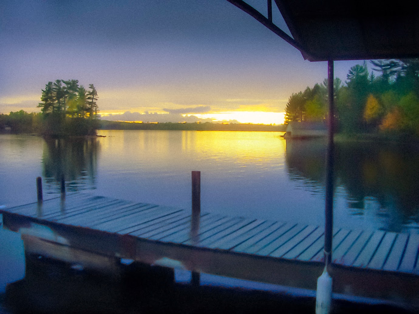
The top image is the original of the smoke coming through the trees in the morning light. I made minor adjustments in Lightroom of increasing contrast, decreasing highlights, and increasing clarity a bit.

The second is after I used Topaz Clarity to change the whole color scheme pushing green, yellow and red to their warmer settings. I also used Photoshop to tint all whites to blue which increased the color contrast of the now bluish light against the warmer trees. This image is all about contrast and not only tones, but colors must be emphasized.

In the next image I used Topaz Simplify to remove a lot of the needless and distracting detail. Back in Lightroom I used Split Toning to once again turn highlights towards a bluer tint.

For the last full size image after I'm done playing around I'll sometimes take the original image and my final affected image, and put them both onto separate Photoshop layers in a new file. I'll then merge these two images. In this case merging is done by decreasing the opacity of the top layer by 50% so that you see 50% of both images. That is, you get 50% of all of my changes on top of the original.

That's fine when displaying a low resolution image on the internet. but what if you're going to print the image in a 20x30 inch format, which is my typical goal? The final image below is what a portion of the image would look like when printed in large format. This is something else entirely as far as image editing.

Many more steps are involved using Lightroom, Photoshop and Topaz filtering in order to produce an image which looks pleasing in large format. You can see that the last image below isn't sharp for one thing. We eliminated detail early on, but new types of detail will need to be add via Topaz. For example, edge and pattern delineation which will provide a more graphic/drawing appearance.

But now the sun is getting low in the distance and it is time for me to get out there a burn some leaves of my own!

Monday, October 6, 2014

Steampunk Sculptures - The Dubuque Transducers

 
These are the last of my Circular Obsessions sculpture series. The others in the series were may over four years ago. I closed my Minnesota studio when we moved to Iowa. I had a few left over pieces and decided to make something of them.

You can see the rest of the series at jimbolesdesigns.com

Click on the sculpture gallery and the Dubuque Transducers are on the 2nd page.

The spheres are torchworked glass as are the 'insulators' connecting the spark plugs.

The metal rings are antique cast iron heat grates/vents from the 1800's. There were forged in a foundry in Dubuque, hence the name.

A transducer is a device which transfers one form of energy to another. In this case these will transport you to Dubuque, but I'm afraid to turn them on.

Or... they were very successful in transferring my creative energy into wasted energy :)
It was great to conclude with these two.
 
 
I love designing them, but putting them together can be tedious when making all the disparate parts fit together.

Sunday, October 5, 2014

Old Time Postcard Effect Using Lightroom


The image to the left was created at less than 1 MB size so I decided not to bother to use Photoshop and instead used Lightroom to see how far I could push a small file in the process of re-visioning it.
The image above (click to enlarge for full effect) was created in Lightroom by using the setting is 'odd' ways. It is reminiscent of the cheaply made postcards of the 1930's or thereabouts. I'll outline the main changes used to create the effect.
 
Noise Reduction
  •    Luminance - This was set at 71. The further you push it the blurrier the image gets.
  •    Detail - Set at 35. Lower numbers produce a more blurred effect.
Sharpening
  • These were all set to off. Interesting though, if you wanted an outline effect in high contrast areas (another attribute of  old time printing) you can set these to max, achieving a nice line effect instead of a soft contrast.
Grain
  •    Amount - Set to 20, Size to 90, Roughness to 60.
All of these control the amount of spottiness in the final image. Old printing process were crude in comparison to today. So increasing these settings make the image look more like an old print.
 
White Balance
  • Temperature - Set to -21 to create an blue overcast
  • Tint - Set to +2
Under the Basic drop down box I set the following
 
Clarity - Set to -31. Using clarity in the negative numbers is a great way to create a very soft image.
Vibrance - Set to +24
Saturation - Set to +40.
 
In old prints they didn't have inks developed to produce nature color. The odd saturation of those prints is one of the hallmarks of that period. I seldom use saturation in Lightroom, and instead leave that to Photoshop where I have finer control over it. In this case saturating the image as a whole helps create the effect.
 
The other controls under the Basic dropped down were adjusted to change the tonal values specific for this image which was underexposed. They would be different for each image and not specific to create the ole time effect.
 
Split Toning
  • Highlights - Set to yellow and saturation set to 57, and a balance of +38
This was done to compensate for the blue tint that was added with white balance changes. I wanted the sunset to be more yellow.
 
Now for the brush effects. In early versions of LR I did not use brushes at all. They were resource hogs and would slow done the PC, and they had a very limited number of controls. I was pleased to find those are no longer limitations in LR 5.
 
There are 4 main brush effects
 
1. The sunset need a greater exposure so I set it to +.04, and I added color of yellow, and the amount of the brush was set at 53. The brush was used across the whole horizon area with a size of 21. All brushes used had max feather.
 
2. The whole bottom dock area was brushed with a Temp setting of -10 to increase the color contrast with the sunset and to aid in the creation of odd coloring like the old prints have. Noise was also added of 100. This helped to lower detail. Lowering the level of perceived detail helps in focusing the viewer away from that area, and helps in old postcard effect.
 
3. The middle-ground trees on the left and right had their own brush for saturation of 53, clarity of -2, and exposure of +.46. These settings help in creating color distortion and also make them a bit more blurry.
 
4. The sky was darkened by the final brush with an exposure setting of -.95


Saturday, October 4, 2014

Image Re-visioning - What the Camera, Eye and Mind See

 I've taken hundreds of pictures of sunsets from this spot on the Lake Vermillion in northern Minnesota. It a ritual my wife and I do nightly maybe while were feeding the ducks too.
 
In all the years of shooting the same scene I've never seen my camera produced images like the top image. It lacks any of the cooler colors. My white balance was set to the full sun setting, and the 'cloud' setting produced the same image. I thought maybe it was just a setting I changed somewhere without knowing, but my wife's camera was doing the same thing.
 
Using Lightroom I was able to bring back some cooler colors by shifting  Temperature and Tint. I shifted the Temperature way to the cool side which normally would distort an image. As you can see in the image to the left it doesn't look great, but at least it isn't all yellow.
 
I could have played with it in Lightroom or Photoshop to bring it closer to what we saw, but what fun is there in that?

I'm seldom interested in recording just what nature provides, and skipped ahead to produce my revision. In typical style the image to the left is over saturated, and a little Photoshop warping was done to the water to create a bit more movement.
 
Also you might notice the dimensions have also changed. The image is a bit taller and stretched out which provided room for more water movement.
 
The image to the left is a complete departure from the others. The sun was blinding off of the water just before sunset, and it had been raining all that day with a misty feel in the air. I wanted to create the sensation of intense light breaking through the mist.
 
I'm glad that my camera normally captures a scene correctly, but it was rewarding in this case to explore my own sense of what I wanted to see.