

Shape - The image to the left is from online learning materials from the Natomus High School's design department. I think of shape as the most primitive design element, and by primitive I mean basic, instinctive, or elementary. When using line or point it takes considerable time to construct an image and a bit of planning, but with a few shapes you can create a striking design as seen in this poster.
Shapes are more immediate. It is as though our brains are more attune to shape than some of the other design elements. Point and line are harder to find in nature. They are there but you have to think about it. I'm hard pressed actually to think of examples of point in the natural world except stars. Shape is seen for what it is immediately and without thought. Silhouettes are an every day part of the visual experience both in high contrast such as the sun shinning through leaves, and in low light settings where we only see indistinct shapes moving across our filed of view.

 Children readily relate to shape. Coloring books are mostly about shapes which they fill in with color. On the other end of the spectrum the great artist Matisse was praised for his work doing papiers coupes late in his life. They are considered the final triumph of his career. You have to wonder how much his advanced age, illness, and limited physical ability reduced him to a simplified form of expression. His work is often described as childlike, and I disagree with those that say that no mere child could have created the shape-based work like Matisse's paper cutouts. Too often art is conceptualized to death. Letting yourself see the elemental in the complex, and behold the primitive, is something that a lot of adults cannot do with great facility. A child on the other hand has no problem because in a sense they are primitives.
Shape has a close relationship to line and form. Shapes by definition are two dimensional with a distinct boarding out-line. The other edge is a type of line. Shape will also morph to form as tones are increased changing it from a two to a three dimensional object.
In the images of lilies below it is easy to see how shape evolves into form as shifts of tone and hue are added. Moving from left to right increasing amounts of hue and value detail is added. In the second row the images become more recognizable as the Photoshop Cutout filter's sliders were adjusted to added more detail. There were two filters used in combination Cutout and the Water Paper. The Water Paper filter was used to increase contrast in the original image, and was kept at a constant (15, 60, 80) throughout the series. The increased contrast produced a better shape abstraction from the starting.
The Cutout filter was set to 2, 10, and 3 for the top left image. As you move to the right the Number Levels slider was increased by one for each successive image. The Edge Simplification slider was also in turn lowered by one for each image. The Edge Fidelity slider was keep constant at 3.
 |  |  |
 |  |  |

There are any number of ways to abstract an image into shapes in Photoshop.The image above was created using the filter Maximum (set to 48) found under the Other filter menu pick.

Pattern implies a repetition of some sort as you'll find in many pattern recognition tests like the red and blue pattern test below. You are expected to pick which pattern A through F (on the right) best fits into the empty space in the full pattern on the left. Pattern recognition is a large scientific field of study for understanding intelligence, and also for 'machine' learning.

Repetition and shape are the primary design elements in the tessellation design to the right. Together they form a pattern.
The initial pre-attentive appreciation of graphic arts occurs on a more primitive level - a level where appreciation occurs before cognition.
That theory would be an interesting Sensation and Perception research project to prove, and is currently being research by scientists.
 |  |
What is Visual Gravity & Pre-Attentive Processing
A good piece of art or design has a certain power to capture your attention, even if momentarily. Some express that quality as a visual gravity - the power to pull you into the image. An initial attractive force happens before you are aware what the image or art object is, and in fact in the case of abstract art, the image may be relatively meaningless on the strictly cognitive/analytical level, but nonetheless you may be attracted to it.
There is no greater complement than for someone to love your work and not be able to tell you why.
As mentioned, pattern recognition has been studied by scientists for years. What I'm referring to here is something which occurs before that and is now being studied as pre-attentive processing. In laymen's terms, you must first recognize that patterns exists before you can determine the type of pattern. How we do that is by pre-processing visual stimulation categorically in order that higher-order cognitive processes have something to work with.
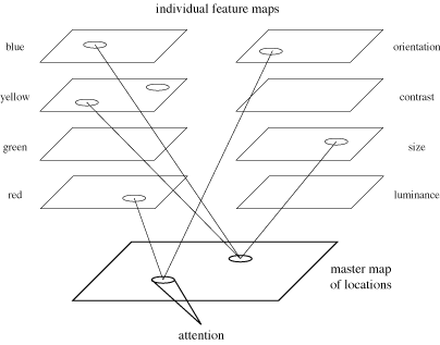 In the diagram to the left there are two sets of pre-processing filters. One for color and another set for categorizing sensation by size, contrast, luminance, etc. The 'master map of locations' can be thought of as our field of view where all the 'filters' map to. Our experience of attention follows after the filters have done there work.
I don't find it surprising that scientists are naming the various pre-attentive filters similarly to the elements of design. Dr. Healey is in the department of computer science at Noth Carolina State University. He has a great web page explaining this in great detail. It is a fun page with a lot of interactive demonstrations. There are also intriguing references to articles such as Perception and Painting: A search for effective, engaging visualizations. His work is published in very exclusive journals by ACM and IEEE. Probably not light reading.
Again, thinking about this from a laymen's point of view. Survival of the species depends on making sense out of vast amounts of visual information and doing it fast and accurately. We can't do a lot of thinking when danger is present. We must recognize it and run. Over the eons our visual system(s) have evolved to detect small amounts of movement out of the corner of our eyes, efficient relative spacial positioning through binocular vision, and separate physiological systems for color and value (rods and cones) to name a few. We don't think about any of these things. Images that already make sense are presented to us. In effect, attentive decisions have already been made. The graphic artist must effectively engage these pre-attentive filters for advantage, and the guidance system is the elements and of principle design.
It is my belief that the elements and principles of design were created intuitively over time, and that intuition is based on our pre-attentive processing systems. These elements and principles help to create images with visual impact, because they assist in organizing image components into a visual hierarchy attuned to our psycho-biology.
I believe that each design element can be used to enhance or distract from an image's visual gravity. Each can be tweaked, removed, relocated, or otherwise reworked to find their proper place in the visual hierarchy of the design. For the most part, all design elements initially work on a subliminal level (during the first milliseconds of visual sensation) in an orchestrated effort creating a visual impact (or not creating as the case may be). Those milliseconds of pre-attention affects us, resulting in our gaze lasting seconds or much longer based on the how strong the visual gravity is.
Attention is fleeting, especially in this age of over stimulation. Capturing attention is the ultimate goal of graphic design, then comes the message/purpose you were hired to deliver or desire to express. But that's only possible if your image has enough initial visual gravity - otherwise, they will just turn the page.
All that said, there are other more higher-order reasons why we might gaze at an image such as shock, puzzlement, sex, comedy, the grotesque, etc. Those too are techniques to call attention to an image, but those are in the realm of the cognitive experience for the purpose of entertainment, education or other purpose. An image that has both pre-attentive attraction, and its message/purpose is also engaging, then that image has full visual gravity.
We will get back on track to talk about the design element shape via digital tools. But first, here is a fun illustration of a type of visual processing failure (Complements to Dr. Healey's page mentioned above).
 |
When you mouse over the square an animated gif file is shown which is composed of two images alternating by a flash. They are exactly the same except for a slight but significant difference. If you saw them side by side you would immediately see the difference, but because they are 'blinking' (like your eyes do) the result is difficulty in determining what is different. This is called change blindness.
In case you are not seeing the difference I'll publish the answer at the bottom of this post... when I'm finished.
.... to be continued.


