Saturday, October 11, 2014

Fall Colors with Fog

OK... Your neighbor is burning leaves, and you can't open your windows on one of the last nice fall days. Or even go outside for that matter without choking on smoke. So what do you do?

Make art of course!
 
The top image is the original of the smoke coming through the trees in the morning light. I made minor adjustments in Lightroom of increasing contrast, decreasing highlights, and increasing clarity a bit.

The second is after I used Topaz Clarity to change the whole color scheme pushing green, yellow and red to their warmer settings. I also used Photoshop to tint all whites to blue which increased the color contrast of the now bluish light against the warmer trees. This image is all about contrast and not only tones, but colors must be emphasized.

In the next image I used Topaz Simplify to remove a lot of the needless and distracting detail. Back in Lightroom I used Split Toning to once again turn highlights towards a bluer tint.

For the last full size image after I'm done playing around I'll sometimes take the original image and my final affected image, and put them both onto separate Photoshop layers in a new file. I'll then merge these two images. In this case merging is done by decreasing the opacity of the top layer by 50% so that you see 50% of both images. That is, you get 50% of all of my changes on top of the original.

That's fine when displaying a low resolution image on the internet. but what if you're going to print the image in a 20x30 inch format, which is my typical goal? The final image below is what a portion of the image would look like when printed in large format. This is something else entirely as far as image editing.

Many more steps are involved using Lightroom, Photoshop and Topaz filtering in order to produce an image which looks pleasing in large format. You can see that the last image below isn't sharp for one thing. We eliminated detail early on, but new types of detail will need to be add via Topaz. For example, edge and pattern delineation which will provide a more graphic/drawing appearance.

But now the sun is getting low in the distance and it is time for me to get out there a burn some leaves of my own!

Monday, October 6, 2014

Steampunk Sculptures - The Dubuque Transducers

 
These are the last of my Circular Obsessions sculpture series. The others in the series were may over four years ago. I closed my Minnesota studio when we moved to Iowa. I had a few left over pieces and decided to make something of them.

You can see the rest of the series at jimbolesdesigns.com

Click on the sculpture gallery and the Dubuque Transducers are on the 2nd page.

The spheres are torchworked glass as are the 'insulators' connecting the spark plugs.

The metal rings are antique cast iron heat grates/vents from the 1800's. There were forged in a foundry in Dubuque, hence the name.

A transducer is a device which transfers one form of energy to another. In this case these will transport you to Dubuque, but I'm afraid to turn them on.

Or... they were very successful in transferring my creative energy into wasted energy :)
It was great to conclude with these two.
 
 
I love designing them, but putting them together can be tedious when making all the disparate parts fit together.

Sunday, October 5, 2014

Old Time Postcard Effect Using Lightroom


The image to the left was created at less than 1 MB size so I decided not to bother to use Photoshop and instead used Lightroom to see how far I could push a small file in the process of re-visioning it.
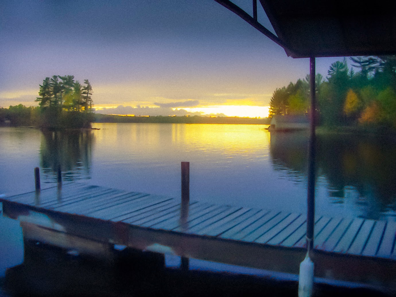
The image above (click to enlarge for full effect) was created in Lightroom by using the setting is 'odd' ways. It is reminiscent of the cheaply made postcards of the 1930's or thereabouts. I'll outline the main changes used to create the effect.
 
Noise Reduction
  •    Luminance - This was set at 71. The further you push it the blurrier the image gets.
  •    Detail - Set at 35. Lower numbers produce a more blurred effect.
Sharpening
  • These were all set to off. Interesting though, if you wanted an outline effect in high contrast areas (another attribute of  old time printing) you can set these to max, achieving a nice line effect instead of a soft contrast.
Grain
  •    Amount - Set to 20, Size to 90, Roughness to 60.
All of these control the amount of spottiness in the final image. Old printing process were crude in comparison to today. So increasing these settings make the image look more like an old print.
 
White Balance
  • Temperature - Set to -21 to create an blue overcast
  • Tint - Set to +2
Under the Basic drop down box I set the following
 
Clarity - Set to -31. Using clarity in the negative numbers is a great way to create a very soft image.
Vibrance - Set to +24
Saturation - Set to +40.
 
In old prints they didn't have inks developed to produce nature color. The odd saturation of those prints is one of the hallmarks of that period. I seldom use saturation in Lightroom, and instead leave that to Photoshop where I have finer control over it. In this case saturating the image as a whole helps create the effect.
 
The other controls under the Basic dropped down were adjusted to change the tonal values specific for this image which was underexposed. They would be different for each image and not specific to create the ole time effect.
 
Split Toning
  • Highlights - Set to yellow and saturation set to 57, and a balance of +38
This was done to compensate for the blue tint that was added with white balance changes. I wanted the sunset to be more yellow.
 
Now for the brush effects. In early versions of LR I did not use brushes at all. They were resource hogs and would slow done the PC, and they had a very limited number of controls. I was pleased to find those are no longer limitations in LR 5.
 
There are 4 main brush effects
 
1. The sunset need a greater exposure so I set it to +.04, and I added color of yellow, and the amount of the brush was set at 53. The brush was used across the whole horizon area with a size of 21. All brushes used had max feather.
 
2. The whole bottom dock area was brushed with a Temp setting of -10 to increase the color contrast with the sunset and to aid in the creation of odd coloring like the old prints have. Noise was also added of 100. This helped to lower detail. Lowering the level of perceived detail helps in focusing the viewer away from that area, and helps in old postcard effect.
 
3. The middle-ground trees on the left and right had their own brush for saturation of 53, clarity of -2, and exposure of +.46. These settings help in creating color distortion and also make them a bit more blurry.
 
4. The sky was darkened by the final brush with an exposure setting of -.95


Saturday, October 4, 2014

Image Re-visioning - What the Camera, Eye and Mind See

 I've taken hundreds of pictures of sunsets from this spot on the Lake Vermillion in northern Minnesota. It a ritual my wife and I do nightly maybe while were feeding the ducks too.
 
In all the years of shooting the same scene I've never seen my camera produced images like the top image. It lacks any of the cooler colors. My white balance was set to the full sun setting, and the 'cloud' setting produced the same image. I thought maybe it was just a setting I changed somewhere without knowing, but my wife's camera was doing the same thing.
 
Using Lightroom I was able to bring back some cooler colors by shifting  Temperature and Tint. I shifted the Temperature way to the cool side which normally would distort an image. As you can see in the image to the left it doesn't look great, but at least it isn't all yellow.
 
I could have played with it in Lightroom or Photoshop to bring it closer to what we saw, but what fun is there in that?

I'm seldom interested in recording just what nature provides, and skipped ahead to produce my revision. In typical style the image to the left is over saturated, and a little Photoshop warping was done to the water to create a bit more movement.
 
Also you might notice the dimensions have also changed. The image is a bit taller and stretched out which provided room for more water movement.
 
The image to the left is a complete departure from the others. The sun was blinding off of the water just before sunset, and it had been raining all that day with a misty feel in the air. I wanted to create the sensation of intense light breaking through the mist.
 
I'm glad that my camera normally captures a scene correctly, but it was rewarding in this case to explore my own sense of what I wanted to see.


Sunday, September 7, 2014

Photogrammar's Images of Pittsburgh


I recently came across a historical pictorial archive which belongs to the Library of Congress, and has been presented to the public via Photogrammar. Photogrammar is an effort by Yale University which gives the public easy access to the images. The following is a clipping from that site.

The FSA-OWI

 
From 1935-1944, the Farm Security Administration — Office of War Information undertook the largest photography project ever sponsored by the federal government.

Origins

After a series of setbacks in the courts that repealed many of the First New Deal’s program, President Roosevelt pursued a new set of initiatives including the Resettlement Administration in 1935. It was charged with aiding the poorest third of farmers displaced by the depression and particularly focused on resettlement on viable lands and providing low-interest loans. Directed by Rexford Tugwell, a Columbia University economist, the RA came under immediate scrutiny. Realizing the battle for public opinion had begun, Tugwell hired his former student Roy Stryker to lead the Historic Section within the Information Division of the RA, which in 1937 was moved to the FSA.

Mission

In order to build support for and justify government programs, the Historical Section set out to document America, often at her most vulnerable, and the successful administration of relief service. The Farm Security Administration—Office of War Information (FSA-OWI) produced some of the most iconic images of the Great Depression and World War II and included photographers such as Dorothea Lange, Walker Evans, and Arthur Rothstein who shaped the visual culture of the era both in its moment and in American memory. Unit photographers were sent across the country. The negatives were sent to Washington, DC. The growing collection came to be known as “The File.” With the United State’s entry into WWII, the unit moved into the Office of War Information and the collection became known as the FSA-OWI File.

My first dive into the site landed me in Pittsburgh, time traveling back to when coal mining and steel production were in their prime, pollution was rampant, and squalor was all too common. In contrast to the somewhat comical image above the images of Pittsburgh from that point in time are fairly depressing. If this is the image of the city people had, or still may have, then that is why I often had to explain - Pittsburgh isn't like that anymore.
 
 
Nonetheless, in many ways Pittsburgh hasn't changed that much even with the many and varied improvements which more than counterbalance the bad.... depending on where you live in the city, of course. There is quite contrast between the image from around 1935 above, with the active mills in the distance, and my shot last winter when I was home. Color makes everything better, along with a clear and clean sky. As I walked the neighborhood however, many of the homes are just waiting for their final chapter which may not ever come.
 

As you'll see in my slide show pollution reigns supreme. It is no wonder that the office workers in downtown Pittsburgh had to change their nice white shirts at noon in order to be presentable! My collection has images of the interior of mines, steel mills, and portraits of the people who made Pittsburgh strong during the support of the war effort. I was somewhat shocked when viewing the conditions they lived and worked in.
 
Yes, you know it is bad in mines, even today. But like so many things in our way of living we just can't pay attention to all the dark side of things. It was interesting to see the home of a mine superintendent living is relative splendor, and then look at the miners being trolleyed around in mining cars.
 
The dilapidated housing, called slums in the captions for the images by whoever catalogued the FSA-OWI collection, really hit home for me. I grew up not that far from those 'slums' which I saw on a daily basis when walking 2 miles to high school.
 
My favorite part of my slideshow are the portraits. There is a hint of despair around the edges, but in most cases they seem to be genuinely smiling. It was the post-depression era, and the entry into WWII. They had work to do, and they were doing it, men and women alike. You'll see a few Rosie-the-Riveters, along with what eventually became war-time propaganda imagery.
 
The Photogrammar site is easy to use. I encourage you to do your own time travel and let me know where you ended up!
 
Take a look at my collection too. It is a visual education on the blood and sweat that made the country strong when we needed to get the job done.


Saturday, September 6, 2014

BoomTown in Vinton Iowa


The Iowa Pyrotechnic Association puts on a yearly fireworks event in Vinton Iowa called Boomtown. Outsides of the fireworks you might see for a large international event Boomtown is an incredible display of fireworks wizardly complete with fireballs and 'train wrecks'.
 
This is the first year I took pictures. Next year I'm going more prepared with a long lens and cable release. My goal will be to get 'inside' of the explosions and still have it be sharp. This idea was inspired by the shot below. I'd like to get a full frame of just a portion of the explosion so that you can see the actual fiery pieces and then go from there to create compositions from several shots.
 
If you want to see more I have a slide on the second page of my photography gallery. Click on 'Next Screen.'


Sunday, August 24, 2014

Hotel Pattee - A Hidden Jem in Western Iowa

Where to start....
 
My wife gave me a magazine page with a hotel and spa circled. OK, I filed it and would pull it out for her birthday or anniversary or whatever. Six months later I needed a birthday gift and I found the magazine clipping. I called and made the reservation. I was asked what room I wanted and was given three options. I chose one and that was that. I never even Googled it. It would just be a weekend outing and she could have a spa experience. 
 
End of story... so I thought.
 
 
The hotel has a rich history that I can't go into here. The overall décor is Mission style for the lobby, dinning, library, conference and others areas on the main floor.
 
But that's just the start...
 
Every room is done to a different theme, and I don't mean that someone went to HobbyLobby or BB&Beyond and bought a bunch of junk made in China to 'theme-up' a room. The artistry and craftsmanship are uncompromising, and in many cases exquisite. Each room was designed and executed by specialist in each theme.
 
The hotel is a registered historic landmark, but that says nothing of the 10 million spent just for the renovation. I've done a lot of craftwork, painting and my own artwork. I looked, and looked hard, but I could not find a sign a sloppy workmanship in the Dutch themed room Jean and I stayed in. The living space was art, and well beyond just being artfully done. Not to my taste exactly, but I had to marvel at the craftsmanship. I know what it takes to be exacting, and the ambiance created by the artwork was not betrayed by disappointing sloppy technique.
 
The bathroom was huge and in a black, white and silver art deco style. Updated fixtures, modern shower, oversized Jacuzzi tub and nicely appointed accents like a heavy crystal ice bucket and porcelain containers for the sundries. Again, being picky, I always look at how the caulking is done in a bathroom. There really shouldn't be any actually, and I didn't find any except in the corners of the shower walls, and it was imperceptible to most people. Pipes and plumbing should never be visible and it wasn't.
 
There were three separate light sources in the bathroom in addition to the added touch of a hidden night light. The three switches controlled lighting for the shower, the sink and one small art deco light above the tub. It was a cool looking design made of silver and glass. I thought to myself... I bet the glass is really plastic. So I stood on the tube and taped the 'plastic'. No, it was glass and engraved with the design company's name. The best part was that it was dimmable to just the level of atmosphere you wanted to create in the bathroom.
 
My only reservation with the bathroom was that it was a bit hard and cold with all the tiling, and echoed, because there wasn't enough sound deadening linen or cloth accessorizing.
 
As mentioned, artisans were hired specifically for each room. The textiles for the Gustav Stickley room were done by Ann Chaves. We purchased a book which outlines each room and the artisans responsible for the work as well as the history of the hotel. The images in this post and the article below are from that book.


 Not only the rooms but the exterior of the hotel has many fun art touches. The image to the left is the view from the Dutch room. The Picasso-like painted steel horses stand at least ten foot tall on the roof of what may be the conference room.
 
There is another book dedicated just to the artwork throughout the hotel. Both books are available at the front desk. The image of the Indian below is a hand painted leather carving and embossing found in the American Indian room. There are a series of these in the dinning room along the backs of each booth (see above). These are awarding winning works of such quality I've never seen. The three dimensional look goes even further in the large pieces in the booths. It was quite a pleasure having your breakfast or dinner in a place where there are so many nuisances to observe. A feast for the eye and mind to wonder at, adding to the overall dinning experience.
 
I would have loved to have the opportunity to photograph the whole hotel. The book does a very good job pictorially, though I would quibble with the exposure level of some of the shots and the color balance may be off just a bit to towards the red.
 
Two more rooms are pictured below. The stark differences in design obviously reflect their Japanese and American Indian origins.
 
The hotel also contains a spa and a bowling ally! I was tempted to put on some bowling shoes, but doubted that they would have a pair of size 13 double wide for me.
 
There is also an outside courtyard where a great variety of musical guest play during the week and weekends.
 
Oh, and the food was top notch too. Jean had a steak which she says was one of the best she's ever had and she's had some of the best.
 
Our visit consisted of six drinks, dinner and breakfast, the spa, tip, and the room for $350! Oh, and the book too! That's a fantastic price for such a unique place. The hardest part will be deciding what room to pick the next time we go there. Perry Iowa is less than 30 minutes from Des Moines, and we plan on taking in a Des Moines venue, and then heading up to our hidden gem on future visit.


Monday, March 10, 2014

zBook Performance Considerations - Oh.. Those Memories

I've had a few questions from folks regarding this blog about the performance of the zBook and several Mac folks were also asking what my opinion was of the DreamColor compared to a Mac.

It is easy for me to avoid the Mac Vs PC question/wars. I just don't have enough Mac experience. One advantage of the Mac was Thunderbolt Technology which the zBook now optionally has. I haven't used it myself yet. As time marches on and my Photoshop files get bigger I'll have the option of adding SSD (solid state device) via Thunderbolt. I wouldn't buy a zBook without that option.

This post is mostly about the optional SSD you can have installed by HP in you zBook. I'm old enough to still have memories of buying a 2Meg memory card for the IBM AT. That was a really big deal back then. I mean really Big deal. It was a foot long and 3-4 inches wide and just chalk full of soldered in place memory chips which must have been about 64K each.

The zBook boots in about 10 seconds which I've read is partly because of the 32G of flash technology SSD. Boot time has never really been a large concern of mine. Coming from an old XP system anything would be better.  I'm new to SSD, and found SSD Tweaker by Elpamsoft interesting, but question whether it is necessary, and if it would actually work, given there are a different types of SSD. Here is a review of the product. My understanding at this point is that the flash type SSD will maintain itself fairly well.  HP Support sent me this link to do a little reading on the MSATA, L6M type installed  in my zBook. For an overview of SSD technology in general check out this page.

Here are a couple other reference sent to me by HP Support.

HP Rapid Start Technology
Drivers, Software & Firmware for zBook 17

My question to HP was why can't I see the SSD on the Windows level. I just wanted to see what the capacity utilization is. Maybe I could benefit from a larger capacity unit. Their response was that you don't see this type of SSD, except in the Windows Disk Management utility where you might see how it is partitioned... but I didn't see it there either. So... for now I just have to believe that it is working. I have no reason to suspect otherwise.

It does show up in the boot process if you hit F2 during the boot. You will be taken to the BIOS management set of utilities which include memory and hard disk test applications. The SSD did show up as HDD #2 and was 32G, and it tested out as being OK. So... it's there and the BIOS can see it. I can only assume it is working.

Yes, there are endless ways to spend your money.

If you want the type of SSD that you can load up like the old RAM disk, there are other products like Fusion-io which advertise advanced IO features in conjunction with Thunderbolt.

Fusion-io announced that the Fusion ioFX workstation flash memory platform is available in the new HP ZBook Mobile Workstation portfolio, which includes the world’s first workstation Ultrabook™. The Fusion ioFX can now also be integrated into HP’s award-winning line of Z Desktop Workstations through external Thunderbolt expansion chassis, in addition to internal integration with HP Z Workstations featuring PCI Express connectors.

And there are many others types of SSD technology products and companies for those that really need that type of performance level. For me, I might get there some day when my Photoshop files get to be several Gig in size. I'll wait and see.

If you have general questions on the performance of your HP system then the Performance Advisor is one place to check up on your system. It is really cool to see your system diagramed out, and then just point and click to the device you want to interrogate.


The system report that you can optionally create is extremely detailed. It includes the Microsoft Experience Index which has sub scores for each computer component. So, if you think you could benefit by upgrading something like memory just look at the memory sub score to get a general indication. For instance my processor score is 7.6. The scale is from 1 to 7.9, so a 7.6 is just about perfect. The overall score was 5.6 and that was because of the graphic adapter scored low. My memory score was 7.7. These numbers are just indicators. Other metrics can be gathered from the Windows Performance Monitor which is worth looking at before making system upgrade decisions.

Interestingly when I looked at the diagram I didn't see my SSD listed. You would think this app which is so thorough would have at least noted its existence.

If you are having performance issues with Photoshop there are more painless and cheaper ways to insure that Photoshop is performing to full capacity. Photoshop users can use the guide by Adobe on the Optimize Performance page. If you are considering a new PC or tuning and old one reading through these tuning options should help you configure a new unit or tune and old one.

Anyway.... that's my trip down memory lane.


Saturday, March 8, 2014

What is Art?


The title asks What is Art? There really is no answer of course. At least no single answer, and even a set of answers which try to pin down something half definitive would just lead to more discussion and argument. We all know that art and craft are different, but then what of high-end craft? I think we regularly think of artisan one-of-kind ceramics, for example, more art than craft.

There is one definition that has rung true for me over the years. David Pye wrote several books in the late sixties which I bought, because I was learning wood tuning and David did some very interesting turnings. In his book The Nature and Art of Workmanship David lays out a scholarly dissertation (published by Cambridge Press) on the distinction between objects made with an element of risk, and objects made that are completely determined from the start.

The distinction isn't between mass produced items and handmade items, rather, the distinction is between how the process is carried out. Is there an element of chance, risk, or some step in the process that isn't fully determined from the start. Mass produced items must be fully determined in order for production to be efficient. Turning pots or making any craft item can also be fully determined from the start in order to produce items which the public can afford... ditto for 'art'.

I'll let David speak for himself....

Workmanship of the better sort is called, in an honorific way, craftsmanship. Nobody, however, is prepared to say where craftsmanship ends and ordinary manufacture begins. It is impossible to find a generally satisfactory definition for it in face of all the strange shibboleths and prejudices about it which are acrimoniously maintained. It is a word to start an argument with.

If I must ascribe a meaning to the word craftsmanship, I shall say as a first approximation that it means simply workmanship using any kind of technique or apparatus, in which the quality of the result is not predetermined, but depends on the judgment, dexterity and care which the maker exercises as he works. The essential idea is that the quality of the result is not predetermined, but depends on the judgment, dexterity and care which the maker exercises as he work. The essential idea is that the quality of the result is continually at risk during the process of making; and so I shall call this kind of workmanship 'The workmanship of risk : and uncouth phrase, but at least descriptive.

What I pick up on in his definition is that it is not the object itself which is categorized, but the process. This idea of risk in your work intrigued me years ago and still does today.

Beauty isn't art. Beautiful things are mass produced every day. Design isn't art. Design is a process whereby we typically want a predictable end. I've spent a lot of time (as can be seen in past blog posts) thinking about design. I love design. I love to make beautiful things, but for me at least that's not art. It is following a recipe. You use the principles and elements of design and you end up with something pleasing. With a little practice anyone can follow a recipe, and maybe improve on it too.

This post came about  because I was looking through some of my old sketch books. The image at the top of the post is from a period many years ago where I was working with ink, markers and pens. Mostly black and white. Quite the opposite of what I'm doing today. In those days everything was undetermined. I would pick up discarded things laying in the street, cut stuff out of magazines, combine drawings from different places, whatever. Anything that caught my eye was potential content. For example, at the bottom of the above drawing is a bunch of glue globs and whole pieces of wheat.  There's a feather in the middle and on top a discarded pack from Kertek cigarettes. Why?... who knows.

Is it art, or, is my more recent work of abstracted pastoral barns and trees art?

I think it is only worth asking... when I'm done with a piece am I surprised by what was created? How much of the process was out of my control (that is, who/what/how was control applied). What risks did I take in the creative process? Where did I push into a new direction? Am I just repeating myself?

These types of questions probe into the creative process, constantly seeking to make it motivationally authentic, more exciting, more challenging, and leave questions of art for others.
 

Saturday, February 22, 2014

EyeCandy - Kilnformed and Torchworked Glass Information Site


I put up my first web site well over ten years ago using Microsoft FrontPage. The focus of the site was my adventures in glass fusing, and teaching various glass fusing techniques. I did this for a number of years and almost made a go of it. But for various reasons decided it was time to move onto other things. I posted a blog post here a few months ago on the Elements of Design in Glass Art, and it has been one of the most popular posts. Because of that I've decided to point glass enthusiasts to my old site which has tons of information on glass fusing.

You can find EyeCandy at http://www.jimbolesdesigns.com/eyeCandy/index.html

There are lots of informative pages and links spread throughout. It was going to be the contact place for my students at the Chicago Avenue Fire Arts Center in Minneapolis, and for my community education classes.

You will also find a lot of glass fusing information at this blog, if you go back to 2010 and before (see links at the left panel) .

Hope you find the information useful. Enjoy!
 

Wednesday, February 19, 2014

Graphic Arts Workstation - Part 4 : Monitor Banding and Other Tests

I received several emails with questions on the DreamColor display. I'm very pleased with it. It has, as I've said, eye-numbing clarity and brightness. Yea, maybe a bit too bright. I'll have to look into that some more. It is easy to tune it down a bit. At this point in my life I'm not as hung up on following absolute standards like ProColor or whatever you prefer. I just don't have the professional nor amateur need to do so. And also as mentioned in prior posts. my right brain has managed to take almost complete control of my home PC. Consequently, I have little patience any more for just sitting around tuning my technology unless my right brain says it needs something.

But, nonetheless, am perfectly willing to help out others who may want to dive deeper into a topic or just ask a few questions on just how good the DreamColor is. And to that end I'll explore the topic of gradation and banding. This is a pet-peeve area for even my right brain. I hate watching movies on my 45 inch plasma and see all those gradations in the shadows. It drives me nuts, and ruins the whole experience... albeit momentarily.

The last place I want to see banding is in Photoshop when I'm processing one of my images.

So with that in mind I decided to do some tests. I propmptly went into Photoshop CS4 64 bit version and did a black to white gradation... don't laugh. Of course, it was all sorts of  banded. Yea, I could dither or a half dozen other smoothing tricks, but that's not really the solution is it.

Besides, if I'm sharing ideas with others we need a standardized methodology. So, wha-la... just Google gradient test and you'll find some. Without too much critical thinking I choose the site http://www.lagom.nl/lcd-test.

I then ran the gradient test on both my DreamColor Display and my Asus ProColor.

First the ProColor

The card is the NVIDIA Quadro FX 560 with the 307.45 driver & bios 5.73
128Meg memory, 1920 x 1200 x 4 million color , 24 inch display
It is currently set to the factory settings for the Adobe RGB mode.

The Lagom gradient test was absolutely smooth. But the blacks were not as rich as the DreamColor. For the Black Level test I could see all the squares except the first one. The background did seem to be absolute black.

Interesting... I ran the test from the DreamColor laptop onto the ProColor external monitor, basically letting the Laptop's newer card drive the external monitor.

The results were very similar. The ProColor is indeed a nice monitor for the price.


Now for the DreamColor

The card is NVIDIA Quadro K610M with 312.56 driver
8.8 Gig Memory, 1920 x 1080 x , 32bit color deptt, 17 inch display
Using the HP Calibration Kit mentioned in prior posts it is set to :
Tone Response Curve : 2.2
ICC Profile Version : 4
Achive Luminance value using video LUT's = True
White Point : x: 0.313  y: 0.329
Luminance: 120
Gamma : 2.2
The Display Preset : AdobeRGB

The visual examination of the Lagom gradation test was a bit disappointing. There is one somewhat distinct band on the very dark end. It is where it going from the darkest possible to some small variation above that where it banded one time. Everything else is perfectly smooth.

The other test of note is the Black Level test. On that test I was not able to see the squares 1-10. That seems pretty significant, and I guess I now have to play with the calibration, or, just make manual adjustment to try to get something better than that.

If anyone has other requests for testing let me know.

Further Testing The Following Day

Yesterday's testing left me with a couple of questions. The first question is the preset I've chosen. AdobeRGB really isn't the best to be working with when you consider the advances in technology. The other question that remained was the driver for the Nvidia card. There are a lot of reports that banding is a common problem.

To resolve the second question I downloaded new drives for the card from both HP and the absolute newest (nonOEM) driver straight from Nvidia. Neither driver fixed the banding, and the nonOEM driver made the HP Calibration Kit dysfunctional with an error message "“Failed to read the prescriptions" and promptly became unusable until I reloaded the new HP driver.

I'll wait for HP to create a new driver to fix the banding.

I also upgraded the test.  For this series of tests I used a 10bit gradation file which can be found at Image Science (http://www.imagescience.com.au/kb/questions/152/10+Bit+Output+Support)

I followed the instructions to insure that Photoshop (PS) was set to use a 10bit file, and it was. The results were a consistent banding across the whole gradation. If I changed PS from 16 bits per channel to 8 bits the banding went away completely.

Just for grins I booted up my old 32 bit XP system with Photoshop on it to see how it would display the gradation on the Asus ProColor. That system has an Quado FX 560 with 128Meg. It actually wasn't that bad. It is running a 32 bit version of PS (versus 64 on the zBook), and the bands were slightly less pronounced and there were fewer larger bands.

Using the HP Mobile Display Assistant you can quickly flip through various color space settings. I ran through them all and non of them had a dramatic affect on the banding. The DCI-P3 seemed to clear up banding the best, but it was also the darkest, and because of that harder to see if there was banding.... and, of course, not a color space for a photographer to use.

All in all, my right brain is beginning to get a little tired of this, because it is all about color lots of variation, and lots of detail.... and all this banding issue is never going to show.... never.

I don't think I'm heading for a Rothko depression period where I'm enveloping myself in fields of darkness.

But nonetheless, the left brain wants to know that my investment is performing properly... whether I ever need it or not.


Friday, February 7, 2014

Pittsburgh Holiday Photography

I spent Christmas in Pittsburgh this year visiting the family, and came away with the following Pittsburgh Holiday images. Any large older city like The Burg has dozens of features which make the city unique. I captured a handful during my brief stay.

The first image is of Heinz Field home of the Pirates. I reworked the image using Topaz Simplify  image editing software . I downloaded the newest version, and it has even more features than the ones I outlined in prior posts. I'll cover the new features in a future post.

Click on the images to enlarge the image
(In IE 11 once you click on it you can click again to enlarge further)


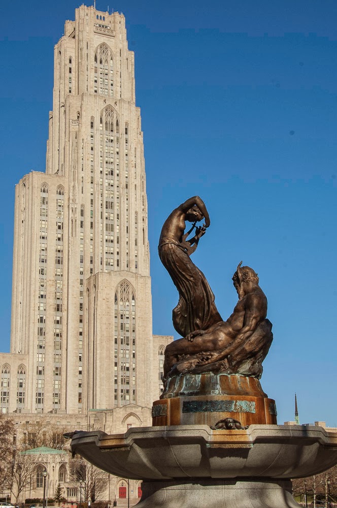
The next image is one of my favorites of the trip. It was taken on the1st floor of Pitt's Cathedral of Learning. I recall studying there are few times during my freshmen year, but there weren't any comfy chairs to camp out on. Before going to Pitt I studied a year a Carnegie-Mellon's fine art department. In art history class they discussed the cathedral, and mentioned that Frank Lloyd Wright was appalled by the structure. Yes, I can see his point. It is a throw-back to another time, but nonetheless is a magnificent building for any university to own.
 
 
Here are a few more from around Pitt. Again, click to enlarge to full size.


The next image is the bronze of Roberto Clemente outside of Heinz Field. He is famous in Pittsburgh, but not so much around the country unless you're a real baseball fanatic. He was a great player. One of the best in fact, but because the Pirates rarely made the playoffs, let alone the World Series, he didn't get the recognition he deserved. He was part of the 1971 Pirates World Series team, and was the MVP of the series. As a kid I would try to do Clemente style 'basket catches', and his famous spinning-twirling throws from deep right field, challenging the runners at home plate.

Imagine twirling like a shot putter to gain momentum, and throwing the ball from deep at the warning track dead into the catcher's mitt at home without a bounce. Unbelievable!
 
As far as this image's development... I emphasized the bronze, warming it up in contrast to the rest of the image. That was done by simply using a Photoshop warming filter and a mask on that layer so that nothing but the statue was affected. Then in Topaz Adjust I neutralized everything else, that is, lowered the saturation levels so that Roberto (the subject) would stand out. As a finishing touch I tinted the sky slightly purple, the complementary color of orange (bronze in this case).


Then there are cathedrals of another sort all over Pittsburgh. Going back several generations, each Pittsburgh neighborhood had their own church or synagogue, etc., and the style of the church illustrated both the ethnic origin of the community and its economic standing. This one is of the Immaculate Heart of Mary parish in the Polish Hill area. What is significant for me in the image is that this is a typical image of Pittsburgh's houses on hills. Whole neighborhoods are often cut into the sides of hills which at times are as steep as ski jumps.

Polish Hill is directly across from Troy Hill, in the distance where I grew up, and in the far distance is Spring Hill. You can't tell but there are two deep valleys in this scene. The valley below Polish Hill has the Allegheny river flowing in it, and the valley between Troy Hill and Spring Hill is called Spring Garden.
 
This type of topography results in the common Pittsburgh saying "You can see it, but you can't get there from here."
 
 
Like many older eastern cities Pittsburgh has many hidden gems like the Heinz Chapel pictured below. Henry Heinz, the founder, was often called The Great Provider for producing his 57 Varieties of canned goods. My Dad, who worked until retirement at the plant, was the great provider for our family. It was olfactory heaven growing up near the plant where you could smell one of the 57 varieties being brewed on a regular basis. Today much of the plant has been converted into high-end condos and lofts. The sign of the times.


Getting back to the holiday theme, and a cathedral of another sort... the following images are from PPG Place. Pittsburgh Plate Glass has a huge presence and history in Pittsburgh. Over the last twenty years, downtown has taken on a whole new feel as slowly but surely what is old and dangerously decrepit is being replaced with new things to do and see. These images are of a skating rink in PPG Plaza where you can rent skates, and whir around what seems to be a grand ice palace from Disney's Frozen movie.


The following are more images of the Plaza and of Market Square which has changed over the years from a pigeon-ridden mess, and has been transformed for the Christmas season into some kind of imaginary garden of marketing delights. You can barely see small wooden houses in the right most image. There were dozens of these making up a temporary mock village all over Market Square, advertising and selling whatever could be sold on those cold winter days.

The image to the left is PPG Place standing sentential-like over the Christmas display including a metal globe tree in the foreground. This image is tinted in an antique postcard-like approach, giving it a slight fantasy feel. (OK... more than slight)
 

I love glass, and I could have spent several hours photographing PGG Place, but it was a miserably cold day and the best shots I could manage are below. These two images show my tendency to break an architectural image down into simple pattern and shape. Glass is cool to work with because you have a definite Mondrian-like framing structure, but within that you have free-form color and texture in the reflections as seen in these two images of grid and reflection.


I like the next image because it takes the grid even further by flattening it out, and complementing the central structure which is really the subject of the image. The rule of thirds is evident in the layout. The image is obviously split vertically into three sections, and the brilliant red tiled dome is in the upper third horizontally. Red is obviously a design element too, where the most stark red is in the subject with subtle green and aqua accents, digitally accentuated of course.


In the next image form is the dominant design element, but without pattern/shape/repetition covering the surface it would be a boring triangular layout.

 
I have to include one quintessential Pittsburgh image, that of a bridge and the city. There are dozens of bridges over the Monongahela (the Mon) and Allegheny rivers. In this case I used the old photography technique called framing to put a frame around part of the cityscape. The paint on the bridge isn't quite that yellow. I enhanced it to build contrast to the rest of image and to emphasize the arch against the blue sky. A vanishing point is a very common technique to guide the eye down a path (the road) into the secondary subject (the city), and then back again when your eye travels up the bridge support, leading you back to the arch.


The Union Trust Building is the subject in the next image which I'm sure Mr. Wright would say is antiquated as well. I'm a fan of Wright, and have visited Falling Water on several occasions. I've marveled at his progressive ideas, but nonetheless the Union Trust is a stonemason's wonder. (See the additional image in the collection below.)

Wright built Falling Water for the Kaufman family whose department store was a grand place back in-the-day, when going downtown to shop was an event.... before the advent of malls. I remember thinking it was sooo cool to be able to order a peanut butter and jelly sandwich cut into petite little squares at Kaufman's Tick-Tock café when I was six or so.


Not to ruin the holiday theme... The following images are of one of several war memorials located on the North Shore area near the Steeler and Pirate stadiums. The Del Monte building is in the background. I think Del Monte owns Heinz, or, maybe more correctly Heinz and Del Monte are just part of the ever growing multinational conglomeration. This memorial is a circular set of metal pillars, holding large sheets of glass containing images of war, including The Bomb going off (not seen here).

Yes, I was thoroughly impressed with what is happening in downtown Pittsburgh and along the North Shore with its museums, casino, tram, and a lot more.