The continuation of this post is way overdue. So why not wait until the last day of the year too! A new job, a new computer, new software, fall photography, trip to Pittsburgh, etc all have kept me very busy. I'm very excited about Lightroom 5 (I was on version 2). I also picked up Topaz Labs ReStyle and ReMask neither of which I'm all that impressed with at the first look. My masking skills (in Photoshop) are decent and I haven't found that ReMask takes me to a new level, but I'm sure I need to spend more time with it. ReStyle is fun at times, but I haven't found it useful for my kind of experimentation. It is great for generating hundreds of tonal and color variations of a single image, enabling you to see an image in new ways. This might be useful in a commercial setting if your client wants to see variations of a composition.
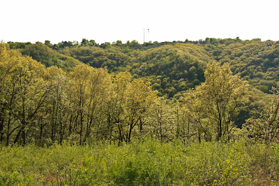
 I'll jump right into finishing up the shape topic by showing what Topaz Lab's Simplify can do to pull shape out of a photograph. Let's start with this unassuming landscape. This isn't an obvious place to start for a study of shape, maybe texture, but shape in the image is hidden by a lack of contrast and no obvious boarders/boundaries between all the greenery.
There is a somewhat distinct fore, middle and background which was what initially attracted me to the image, and that will be the focus of the initial work on this image.
The image below is after the first pass through Simplify. The three sections of the image are more distinct now. There is no masking tool in this version of Simplify. The settings of the program itself resulted in the color and contrast shifts for each section. If you look closely at the original you will notice subtle saturation and hue differences between the three sections. The foreground is slightly more green, the middle more yellow, and the background is also green but a little less saturated as you might expect for objects in a distance. Simplify picked up on these subtleties and exaggerated them, resulting in a more defined composition.
Simplify's settings are grouped into categories consisting of Simplify, Adjust, and Edges. Within the three categories are a total of 18 controls and sliders which yield a vast array of image types from total abstraction to line drawings, to faux painting and drawing styles. Once you have the image adjusted to your liking you can save the settings and reuse them on another image. I use Simplify called from within Photoshop as a plugin (it can be called from Lightroom optionally). When the image returns to PS I name the layer with the naming convention of filter filtername, for example, simplify treeline where treeline is the name of the saved settings in Simplify. This enables me to know how a PS layer was transformed by a tool and what settings were used.
Fig. A.
Simplify's Edges group of controls determine how distinct the outline of a shape is. You can adjust the thickness of an edge, its color, and which shapes get an accentuated edge. The Adjust group of controls set the value ranges (tones) and saturation level. The Simplify group of controls determine the overall number, size, and detail of each shape.
The screen snip to the left shows Simplify's control panel with all of the controls. The screen snip to the right is from the layers panel in PS. The image above is the starting point for the work and it is the first layer on the bottom of the layers palette with 16 layers above it used to complete the image. The finished composition (seen later) is composed of the last four layers (topmost) shown in the layers palette. My typical work flow is to do a series of changes in an area such as the sky, then merge all that work into a new layer. Subsequent work is done on the newly merged layer. Then a new section is worked on, or, other major change such as masking and editing is done. Those changes are then merged into a new image setting the stage for further work.
The Simplify sliders are deceptively simple. I can't go into each one in detail. The most critical ones for control of shapes are: Simplify Size, Detail Strength, Detail Size, and the two 'remove' sliders.
Now for a little diversion... You might not consider digital art on the same level as painting, and in many respects the two media types are hard to compare fairly. For me, the game really comes down to a sense of control. That is, how much control you have over the image creation process, or, to put it more concretely... how much control do you have over the elements of design. Media is a vehicle of expression, and the fullness of expression is only achieved if the artist/designer has creative control of the elements of design.
Water color, oils, acrylics, etc, etc are media types, each with its own characteristics. I would argue that digital art is on equal ground to the extent that it provides full control over the elements of design, and that in a nutshell is what this series is attempting to illustrate.
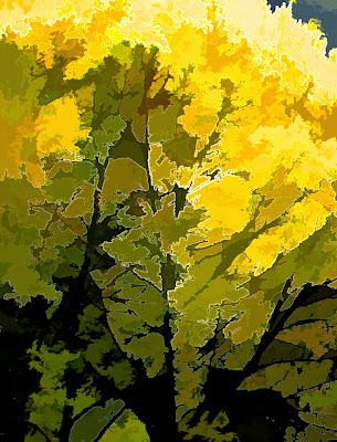
As far as the design element shape is concerned the images below show how Simplify was used to abstract shape from a amorphous mass of detail. The results are quite pleasant. The section shown below represents about 1/5 of the overall composition. The image to the right was taken from the second image in this post (fig A). This small section can be found on the left-most boarder about midway down in figure A. If you click on the image you can get a sense of the detail that Simplify creates. Even greater detail is possible or less depending on your aesthetic direction. The finished image above is even more abstracted as compared to figure A, giving it a misty quality and a more graphic presence with saturated colors.
Depending on what browser you use you can click on any image and a slide show of all the images in this post is displayed. For IE 10 the slideshow allows an easy comparison of the before and after images. You can move from the original and through the other two full size images allowing you to see the evolution of the composition.

Other digital tools can abstract shape from a complex photo, but the level of control you have over shape, line, texture, hue, tone, and the overall level of detail is, as far as I know, is unparalleled in Topaz Simplify.
 I'll jump right into finishing up the shape topic by showing what Topaz Lab's Simplify can do to pull shape out of a photograph. Let's start with this unassuming landscape. This isn't an obvious place to start for a study of shape, maybe texture, but shape in the image is hidden by a lack of contrast and no obvious boarders/boundaries between all the greenery.
There is a somewhat distinct fore, middle and background which was what initially attracted me to the image, and that will be the focus of the initial work on this image.
The image below is after the first pass through Simplify. The three sections of the image are more distinct now. There is no masking tool in this version of Simplify. The settings of the program itself resulted in the color and contrast shifts for each section. If you look closely at the original you will notice subtle saturation and hue differences between the three sections. The foreground is slightly more green, the middle more yellow, and the background is also green but a little less saturated as you might expect for objects in a distance. Simplify picked up on these subtleties and exaggerated them, resulting in a more defined composition.
Simplify's settings are grouped into categories consisting of Simplify, Adjust, and Edges. Within the three categories are a total of 18 controls and sliders which yield a vast array of image types from total abstraction to line drawings, to faux painting and drawing styles. Once you have the image adjusted to your liking you can save the settings and reuse them on another image. I use Simplify called from within Photoshop as a plugin (it can be called from Lightroom optionally). When the image returns to PS I name the layer with the naming convention of filter filtername, for example, simplify treeline where treeline is the name of the saved settings in Simplify. This enables me to know how a PS layer was transformed by a tool and what settings were used.
Fig. A.
Simplify's Edges group of controls determine how distinct the outline of a shape is. You can adjust the thickness of an edge, its color, and which shapes get an accentuated edge. The Adjust group of controls set the value ranges (tones) and saturation level. The Simplify group of controls determine the overall number, size, and detail of each shape.
The screen snip to the left shows Simplify's control panel with all of the controls. The screen snip to the right is from the layers panel in PS. The image above is the starting point for the work and it is the first layer on the bottom of the layers palette with 16 layers above it used to complete the image. The finished composition (seen later) is composed of the last four layers (topmost) shown in the layers palette. My typical work flow is to do a series of changes in an area such as the sky, then merge all that work into a new layer. Subsequent work is done on the newly merged layer. Then a new section is worked on, or, other major change such as masking and editing is done. Those changes are then merged into a new image setting the stage for further work.
The Simplify sliders are deceptively simple. I can't go into each one in detail. The most critical ones for control of shapes are: Simplify Size, Detail Strength, Detail Size, and the two 'remove' sliders.
Now for a little diversion... You might not consider digital art on the same level as painting, and in many respects the two media types are hard to compare fairly. For me, the game really comes down to a sense of control. That is, how much control you have over the image creation process, or, to put it more concretely... how much control do you have over the elements of design. Media is a vehicle of expression, and the fullness of expression is only achieved if the artist/designer has creative control of the elements of design.
Water color, oils, acrylics, etc, etc are media types, each with its own characteristics. I would argue that digital art is on equal ground to the extent that it provides full control over the elements of design, and that in a nutshell is what this series is attempting to illustrate.
These two digital control panels help illustrate a workflow which is a totally different means to an end as compared to classical media. In the digital world you do not prepare a canvas with gesso, but you do consider the size of the canvas, what types of texture you want to convey, and of course the composition of the space follows the same rules. In each PS layer different compositional elements are considered and controlled, sometimes repeatedly and iteratively until the desired effect is achieved. That is one of the great advantages of digital work. A small area or the whole piece can be reworked endlessly, versions saved and compared, and the work completed when you decide and not when the paint is too dry or the paper's tooth is worn out.
In the above workflow there are layers adjusting the background, the sky, the sunset, grain, hue and saturation, line quality, overall detail level, contrast, and much more. The final result is seen below, and as you can see it is a total re-visioning of the original photograph.
Depending on what browser you use you can click on any image and a slide show of all the images in this post is displayed. For IE 10 the slideshow allows an easy comparison of the before and after images. You can move from the original and through the other two full size images allowing you to see the evolution of the composition.

Other digital tools can abstract shape from a complex photo, but the level of control you have over shape, line, texture, hue, tone, and the overall level of detail is, as far as I know, is unparalleled in Topaz Simplify.


