Monday, August 30, 2010
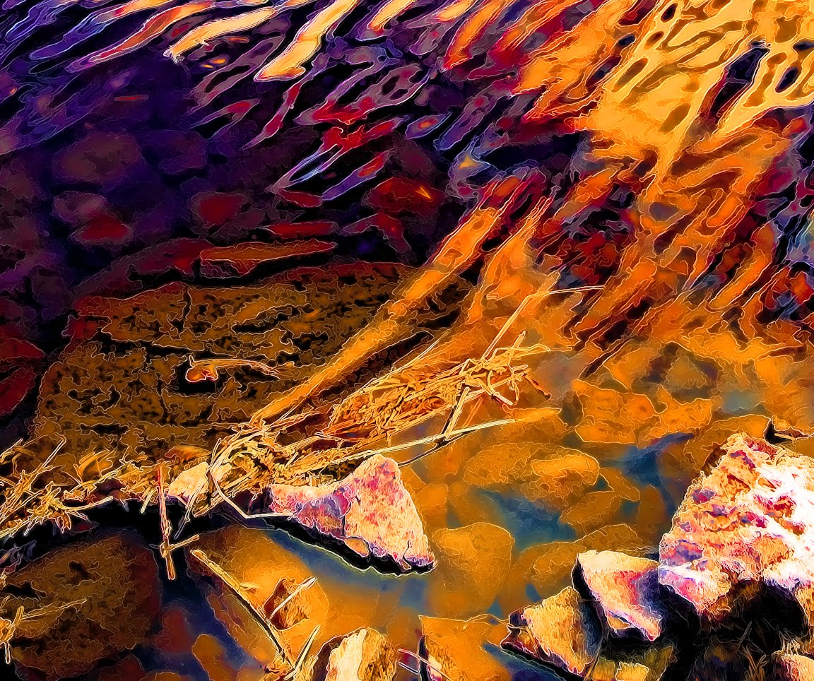
Edible Landscape - Pyschedelic Jello
I recall being in a gallery eavesdropping in on a conversation between two collectors. The one was describing her favorite painting style where the paint is put on so think that it looks like pudding. In the case of the landscape above it reminds me of psychedelic Jello. For one, the water is doing all kinds of rippling in two different directions like a large platter of Jello would do. Then there are the crazy saturated colors not found in nature, but strangely enough in some of the food we eat.
As I've been discussing, I think for once the subject didn't get in the way of color exploration. I find myself often staying too loyal to the original, whereby it acts as some sort of constraint which I constantly measure my efforts against. It's a crutch I need to free myself from.
In this landscape study from a Lake Vermilion photo, I put texture explorations in the back seat and focused more fully on color as I pushed the saturation sliders further than I ever did before. That and some vodka produced colors that I wanted to dive into. Wouldn't it be absolutely crazy if there was a place you could go to for a short visit where the world was colored like this landscape. Of course we couldn't live there, because our eyes would burn out from over sensation.
Maybe that is what a painting is for?.... no.. not to burn our eyes out, but a place to go to for a short visit.
I love how the grass and shoreline turned out. There is enough texture there to keep me from feeling the need for more throughout as was done in the petunia study a few posts back. Both the Topaz Simplify and Clean plug-ins where used multiple times on different layers, along with Photoshop layer masks and other layer adjustments. When you click on the image the enlargement will be close to what the final 20x30 print will look like.
I don't think going psychedelic will work with many subjects so maybe the lesson learned is that I need to choose subjects which 'allow' me to be as nonrepresentational as I want to.
Tuesday, August 24, 2010
Scott County Art Crawl - Oct 9th
I'll be participating in the first ever Scott County Art Crawl. Read all about it and see some of the work at http://bit.ly/bRQ7Dh.
Come by for a feast for the eyes, mind and tummy... I'll have great beer, wine and hors d'oeuvres.
You can preview a lot of my work at http://JimBolesDesigns.com.
DIRECTIONS
4640 139th St. W.
Savage, MN 55378
952 388 3762
Once you found your way to county road 42 (Egan Drive) running east and west through Burnsville/Savage/Prior Lake you can use these directions.
If heading EAST on county road 42 away from Prior Lake, do a U-turn at the Sonic restaurant (the Joppa-Glendale intersection with a traffic light), and head west on 42. Take the first right turn lane (Natchez) after U-turning at the Joppa-Glendale intersection. The Natchez turn comes up quick. Then take the 2nd right (139th St). The studio is a brown building with a white door and trellis in the front, and is to the right of the white brick ranch-style house at 4640 139th St.
If heading WEST on county road 42 from Burnsville take the first right turn lane (Natchez) after passing the Joppa-Glendale intersection (has a traffic light). Then take the 2nd right (139th St). The studio is a brown building with a white door and trellis in the front, and is to the right of the white brick ranch-style house at 4640 139th St.
From downtown savage (Savage Art Studios) take 123rd east to Lynn Ave. Take a right on Lynn and continue on Lynn (which becomes Glendale) until to come to county road 42 (Egan Drive). Follow the directions for WEST listed above.
Here are several maps. The top map shows the location of my studio and you can zoom around to get a large view. The lower maps show the locations of the Savage Art Studios, my studio, and the studio of Chuck Burton another local glass artist.
Monday, August 23, 2010
Pseudo Triptych
The wonders of Photoshop.
Needed to see what three of my digital art pieces would look like together. So why not make a digital display of my digital art... digital lighting and all. Couldn't resist using a heavily textured digital wall to go along with my recent texture posts.
Monday, August 16, 2010
Abstraction Distraction
One of my ongoing themes as of late is determining just what level of abstraction I'm comfortable with in the process of downplaying illustrative or representational imagery. The image above is a macro shot of a white rose. Just the tips of some petals are in focus, and some softening was added too. This image is almost the opposite of what I have been exploring. There is almost no color and texture, and maybe that is why it intrigued me. Softness is a texture, and the warmness and softness together would make a nice background for a cosmetic ad or some such.
Having nearly no detail I put the image into the Topaz Adjust filter just to see what would happen. I choose all the controls to bring as much detail into the image as possible and created this sandstone-like interpretation of the rose. Of course this is the other extreme being all about texture now.
I didn't want to totally lose the softness so a mixture of both is what I went for in the image below. A little bit of Photoshop layer combinations, masks, and other adjustments resulted in this dark dreamy landscape. Kind of nightmarish I think and far removed from the original clichéd cosmetic ad background.
Funny what will be created if you just let impulses guide you. I'm attracted to this image, but afraid of it too on some level. I certainly wouldn't want to turn into another HR Giger. A nice diversion at this point. If more of these dark specters appear I'll have to pray to Monet to save me.
Friday, August 13, 2010
Color & Texture Part Two
I put away my pastels. I was making a real mess of my studio with pastel powder flying everywhere leaving a layer of dust thick enough to write your name. At $5 a stick there has to a cheaper way to experiment with color so I'm back to Photoshop.
The image to the left is a study of color contrasts. It's was hard to keep the screaming yellow in the background. It wanted to jump forward and overtake the subject, but in this case the strongly silhouetted petunias do seem to stand firm against the yellow onslaught. It helps that I down-keyed the yellow to yellow-orange somewhat (do you remember 'Screaming Yellow Zonkers'?).
Equally important for me is visual texture which is not visible in these reduced size images. In the enlargement to the left I'm please by the harmony and balance of color. The more you enlarge a section of the image the more abstract it becomes. The interplay of shape and positive and negative spaces begin to replace 'flowers' as the subject, and that too pleases me since I don't like the portrayal of a 'thing' getting in the way of the color and texture which is the true subject.
In this next enlargement the texture of the 'painting' begins to appear especially if you click on the image to enlarge it further. It is only at this point that I begin to feel comfortable with the work. I spent a lot of time getting the digital brushes and filters to produce this naturalistic texturing. I actually spent more time working the texture than composing and coloring the image. The image started as a photo. The yellow in the background is a field of Black-eyed Susans. I couldn't resist the color contrast with the petunias and had to stop to shot them. Shooting at a high ISO begins the process of abstraction along with a shallow depth of field which creates a yellow backdrop for the purple flowers. The graininess of the ISO setting is the underlying 'cause' of the texture that I develop further with my digital tools.
The finish print will be 20x30 and the full detail of the texture will become evident as the viewer moves increasingly closer. The final image below is closer to the desired overall style. In future work I need to further abstract the coincidental subject (flowers) to bring the actual subject (color and texture) more to the fore even when viewed from a distance. I may finally be pleased with the overall style once the coincidental subject has been subjugated (so to speak) by the actual subject.
The image to the left is a study of color contrasts. It's was hard to keep the screaming yellow in the background. It wanted to jump forward and overtake the subject, but in this case the strongly silhouetted petunias do seem to stand firm against the yellow onslaught. It helps that I down-keyed the yellow to yellow-orange somewhat (do you remember 'Screaming Yellow Zonkers'?).
Equally important for me is visual texture which is not visible in these reduced size images. In the enlargement to the left I'm please by the harmony and balance of color. The more you enlarge a section of the image the more abstract it becomes. The interplay of shape and positive and negative spaces begin to replace 'flowers' as the subject, and that too pleases me since I don't like the portrayal of a 'thing' getting in the way of the color and texture which is the true subject.In this next enlargement the texture of the 'painting' begins to appear especially if you click on the image to enlarge it further. It is only at this point that I begin to feel comfortable with the work. I spent a lot of time getting the digital brushes and filters to produce this naturalistic texturing. I actually spent more time working the texture than composing and coloring the image. The image started as a photo. The yellow in the background is a field of Black-eyed Susans. I couldn't resist the color contrast with the petunias and had to stop to shot them. Shooting at a high ISO begins the process of abstraction along with a shallow depth of field which creates a yellow backdrop for the purple flowers. The graininess of the ISO setting is the underlying 'cause' of the texture that I develop further with my digital tools.
The finish print will be 20x30 and the full detail of the texture will become evident as the viewer moves increasingly closer. The final image below is closer to the desired overall style. In future work I need to further abstract the coincidental subject (flowers) to bring the actual subject (color and texture) more to the fore even when viewed from a distance. I may finally be pleased with the overall style once the coincidental subject has been subjugated (so to speak) by the actual subject.
Monday, July 5, 2010
Color & Texture
I suppose that my interest in the use of glass powders isn't just about color. When I decided to fire my glass to a maximum temperature of 1210 degrees Fahrenheit I discovered I could mix glass powder to any tone, tint or hue without the problem of certain color combinations turning brown. Typically, many warm and cold glass colors when mixed together do not yield a color in between, but instead you get brown. That's because under heat the chemical make up (metal oxides) in glass react with each other. Since the glass granules (fine powder) do not get a chance to chemically interact as 1210, you can actually mix glass powder like you would paint.
Just as important to me I recently realized, is that this temperature also gives a very fine sand-like texture to the glass surface. I like this, because if glass melts together into a completely glossy surface you lose a lot of detail, detail that is necessary if you want the finished work to gain interest as you approach it. Also since most glass artist work very hot and want the gloss look, my textured surface serves as a counterpoint to that general tendency. I like that it is soft looking and inviting. You want to touch it not because it is glass, but because its texture is inviting, something new for the senses. It is really just an expensive sand painting to put it crudely, but because of the intensity of the color and the irregularity of texture, and the design of course, it can be a much more as seen in the April 2009 blog post.
The image above was accomplished with glass chalks and regular glass frit. The glass chalks come in stick form just like normal chalks. The intensity of the warm colors is due to the fact that the chalks are more in the enamel family that glass powder. One of the main characteristics of enamels is that they are heavily pigmented. Just a dusting of an enamel coating is required for opacity and richness versus around 1/8 inch or more of glass powder to create the same opacity and richness. Because of this the chalks enable a leap into visual color mixing that is impossible with glass powders. From a distance the small specs of enamel visually mix and as you approach you begin to see individual specs. It is the small size of the spec coupled with its intensity that enables the visual color mixing even when very close to the piece. You have to be closer than a couple of feet before you begin to see the richness in detail, detail that invites you in even closer.
The image above is of a 5x5 inch square, and is probably slightly enlarged on your screen.
To create this texture cover your glass with #1 frit. Bake it to around 1210 and hold for 10-30 minutes depending on your kiln. Do not allow the frit to round over, otherwise you will lose the 'tooth' necessary for the chalk in the next step. You now has a 'canvas' to work on. The sharp edges of the frit act as a texture like pastel paper has, cutting into the chalk and holding the chalk to the surface of the glass. Do your design on the textured surface. When your drawing is complete, bake to 1450 until most of the chalk has melted into the glass surface.
Regretfully, the chalk does not act like glass and you cannot achieve a sandy surface. Most of the finished work will be glossy though somewhat textured, albeit mostly rounded over texture and not very sandy. Since you have to fire so high the regular glass frit which was your 'tooth' will also be melted into a mostly glossy surface. That's OK though since the micro fine pieces of chalk still do show up as fine distinct pieces of color and do not melt into a amorphous blend.
I'm sure to use this technique on a future powder painting.
Monday, June 21, 2010
Powder Painting Steps In Creation
The link below is to a PDF file which shows the steps during the creation of one of my powder paintings. For this commission the goal was to create a fertile mountain valley scene. Some of the technical challenges were:
- The panel had to start at 1/4 inch thick to withstand shipping, and an approximate size of 32 by 19 inches
- Because of the thickness and overall dimensions long firing schedules were required which made it a several week process to work through all the phases of the painting.
- I wanted a lot of actual texture in the powder to give a feeling of a mountainous landscape. This resulted in increasing the thickness of the panel in some sections and making annealing the glass more of a challenge. Special care must be taken when a glass panel has varying cross sectional thicknesses.
- Multiple firings were required to build the texture, while also guarding against the powder turning to glass. Once glass powders turn to glass there are chemical reactions which can 'discolor' the work.
- Hue shifts had to be planned and balanced with each new layer and firing, because each firing made the underlying layers darker and glassier
The PDF is around 2 meg in size and may automatically jump to full screen mode when you open it. If it does, then to leave full screen mode just hit the Escape key. When viewing the sideshow click on any image to advance to the next slide. The color, as always, will vary from monitor to monitor.
Hope you enjoy the sideshow!
Here is the PDF.
Subscribe to:
Posts (Atom)