

The image to the left was created at less than 1 MB size so I decided not to bother to use Photoshop and instead used Lightroom to see how far I could push a small file in the process of re-visioning it.
 The image above (click to enlarge for full effect) was created in Lightroom by using the setting is 'odd' ways. It is reminiscent of the cheaply made postcards of the 1930's or thereabouts. I'll outline the main changes used to create the effect.
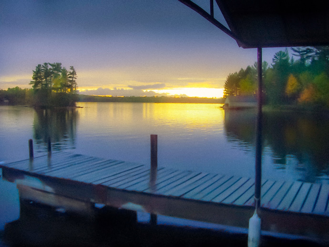
Noise Reduction
- Luminance - This was set at 71. The further you push it the blurrier the image gets.
- Detail - Set at 35. Lower numbers produce a more blurred effect.
Sharpening
- These were all set to off. Interesting though, if you wanted an outline effect in high contrast areas (another attribute of old time printing) you can set these to max, achieving a nice line effect instead of a soft contrast.
Grain
- Amount - Set to 20, Size to 90, Roughness to 60.
All of these control the amount of spottiness in the final image. Old printing process were crude in comparison to today. So increasing these settings make the image look more like an old print.
White Balance
- Temperature - Set to -21 to create an blue overcast
- Tint - Set to +2
Under the Basic drop down box I set the following
Clarity - Set to -31. Using clarity in the negative numbers is a great way to create a very soft image.
Vibrance - Set to +24
Saturation - Set to +40.
In old prints they didn't have inks developed to produce nature color. The odd saturation of those prints is one of the hallmarks of that period. I seldom use saturation in Lightroom, and instead leave that to Photoshop where I have finer control over it. In this case saturating the image as a whole helps create the effect.
The other controls under the Basic dropped down were adjusted to change the tonal values specific for this image which was underexposed. They would be different for each image and not specific to create the ole time effect.
Split Toning
- Highlights - Set to yellow and saturation set to 57, and a balance of +38
This was done to compensate for the blue tint that was added with white balance changes. I wanted the sunset to be more yellow.
Now for the brush effects. In early versions of LR I did not use brushes at all. They were resource hogs and would slow done the PC, and they had a very limited number of controls. I was pleased to find those are no longer limitations in LR 5.
There are 4 main brush effects
1. The sunset need a greater exposure so I set it to +.04, and I added color of yellow, and the amount of the brush was set at 53. The brush was used across the whole horizon area with a size of 21. All brushes used had max feather.
2. The whole bottom dock area was brushed with a Temp setting of -10 to increase the color contrast with the sunset and to aid in the creation of odd coloring like the old prints have. Noise was also added of 100. This helped to lower detail. Lowering the level of perceived detail helps in focusing the viewer away from that area, and helps in old postcard effect.
3. The middle-ground trees on the left and right had their own brush for saturation of 53, clarity of -2, and exposure of +.46. These settings help in creating color distortion and also make them a bit more blurry.
4. The sky was darkened by the final brush with an exposure setting of -.95


No comments:
Post a Comment